Dog Show
by 13mu • Uploaded: Dec. 14 '10 - Gallerized: Dec. '10
Description:
For the dog exhibitions
Status:
Just for fun
Viewed:
21894
Share:

Lets Discuss
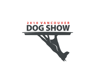
that is funny and witty, but I think it is not appropriate for the exhibition, or is it?
ReplyLove this.. very creative
ReplyHaha it's definitely memorable.
ReplyThis is genious. Faved!
ReplyBrilliant concept!!
ReplyWowza, I love this stuff. This is so clever, i see potential in this being used because it can always be flipped and type under platter where needed. Brilliant.
Replygreat concept. I love when you look at something twice to see something new. very clever. fun.
ReplyWOAH! Genius!
ReplyJust wow, great concept, great execution. Clever.
Replywow! i didn't see it at first and then BAM! great design!
Reply%5Eme too. clever idea.
ReplyJesus Christ Bananas! WOW!
Replynice! -- I had to look twice -- very smart design concept
Replynice, u made me turn my laptop upside down :) good work!
Replymemorable
Replyoh yes :)
ReplyBut isn't it missing a finger and what has a platter got to do with a dog show?
Replycoool!
ReplyRichard, serving/presenting A VancouverDog show for you on a silver patter. Flip it and it's a dog on a platform. Winner winner.
ReplyBig brains behind this!! :)
ReplyIt took me a minute to understand it, and ever since I am but admiring it in silence...
Replycreepy
ReplyThis is by far one of the coolest logos I've seen in a while. Tremendous work.
ReplyInsane in the membrane
ReplyOnce I figured out what it was it was a major, %22WOW%22. Insanely creative.
ReplyVery clever one! (But i must confess i had to look twice)
ReplyAwesome! Very clever!
ReplyWhere else have you posted this before? I know I've seen this on another site somewhere. Loved it then, love it now.
Replygreat vision! wonderful concept
ReplyFantastic work here!!Love the brilliance!!
ReplyWell done 13mu!
Replywow, you've made an excellent job!
Replymemorable...:D
Replyoutstanding.
ReplyThanks for the comments, guys.
Replysuper clever! congrats!
Replyunbelievable!
ReplyMaybe you could add a tail to make up the missing finger? It just feels a little weird to me, don't get me wrong it's a very interesting/original idea.
Replyclever!
ReplyThat is all kinds of awesome.
Replycongrats! great work!
ReplyOne of those logos that's so cool you wish it would get used, but knowing committees I would guess not at this view.
ReplyI normally hate this kind of stuff but this is totally awesome.
ReplyOMG! IT%60S AWESOME!!!!
ReplySeriously, 13mu....where has this been posted before? I know I saw it posted before... Gotta know where!
ReplyFreakishly cool.
Replyha. stunning :) congratz!
Reply2JF Was here brandstack.com, but I erased
ReplyJUST GREAT!
ReplyBrilliant!!!
ReplyExcellent execution
Replymost creative by far that i've seen! love it!
ReplySuper cool. Great job.
ReplyGreat symbol, very nice mark!
ReplyCommon! It's almost hundred floats!**Congrats, Den and you should have done it earlier
ReplyCOOL!
Replydefinitely clever.. but i can't get passed the fact that the dog upside down looks like a _severed_ (and creepy) hand...
Replycool!
ReplyOoooooh!.. This is great!
Replynice nice
ReplyGreat Great Inspiration !!!
ReplyJust stumbled upon this one, brilliant! Truly inspired!
Replyamazing work. that mark is fantastic.
ReplyThis is the bomb.com
ReplyFantastic! I love it.
ReplyBrilhant! Faved and Floated!
ReplyBrilliant
ReplyFantastic work! Congrats!
Replythis is really magic ... !!
ReplyNice concept!!
Replyawesome.......
Replyfantastic logo!
Replyi too join for the congrats! brilliance is often creepy!
ReplyGenius!
ReplyBrilliant :)
ReplyPlease login/signup to make a comment, registration is easy