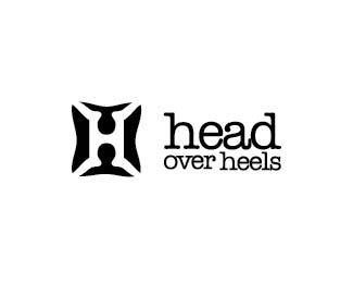
head over heels
by NoeticBrands • Uploaded: Dec. 11 '10
Description:
V2 OF http://logopond.com/gallery/detail/123231
Status:
Work in progress
Viewed:
2707
Share:



Lets Discuss
Something really cool going on with the mark Riz.
Replyi don't think the type layout works. especially how %22OVER%22 looks. i'd go with smaller size for over, and prolly in italics and lose the large tracking. Mark is very, very nice, though i feel the feet are a bit too big for the head?
Reply:)) niiiice one!
Replyi agree with stelian. i think the typo needs some work but the mark is really nice!
Replyany type suggesions guys?
ReplyI would try with %22American Typewriter%22.*http://new.myfonts.com/fonts/adobe/itc-american-typewriter/
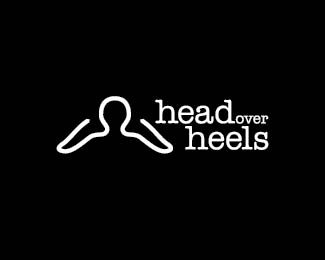
ReplyHi Riz! Completely missed these concepts. Very interesting. I'm wondering if the typography can be more subdominant, tighter and more sophisticated. It would be interesting to see type all on one line, to the right or below the symbol (likely below the symbol on your other concept for sure). The type and symbol are competing with each other here and in your other concept. Very cool concept by the way.
ReplyI agree Sean. I've been trying all sorts of things for type... thats why I asked yall. Thanks for the suggesions...they make sense.
ReplyPlease login/signup to make a comment, registration is easy