Jupiter
by Lecart • Uploaded: Dec. 02 '10
Description:
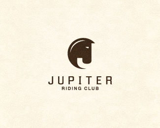
Riding club. Horse and J combo in the mark. Feedback much appreciated.
Status:
Unused proposal
Viewed:
22105
Share:

Lets Discuss
Very clever :)
ReplyHoly macaroni:)*This is very nice Stelian!*I would slightly reduce the size of the eye.
Replyvery nice! ..yea eye should be more smaller or maybe more %22faster/evil%22 looking?
Replythank you for the great %26 fast feedback. you guys were right, I've changed the eye.
ReplyStellar work!
Replynice!
ReplyIf you rotate it 360 you'll notice a 'J' in there :P Some real nice stuff here lecart!
ReplyVery strong. great
Replyelegent and smart, good one
Replyperfect execution, great typography choice also. May I ask you which fonts you used?
Replywow. great work.
Replyloving this. Really great
ReplyVery nice work, I'd almost investigate putting a serif to make the mouth part, where it usually curves in a bit. Either way clever work mate!!
ReplyLove the simplicity and abstraction, very cool.
ReplyNice job man!
ReplyThat's very nice.
Replythis is it
ReplyGreat stuff, really tight illustration.
ReplyI love it!
Replygreat work mate!!
Replyamazing work.
Replygreat, love it
Replywow really nice:)
ReplySweet and simple. Nice job.
ReplyThis is absolutely great ....
Replyawesome work!! I see the J, the horse, and I love the circle that i can%B4t see%3B)
Replyexcellent!
Replysuper
ReplyYou are kicking asses, mister.
ReplyI really appreciate all the kind words!**Alex, type is Enigmatic.**Cerise, i did try some experiments with serif near the mouth before reaching this version, i thought the J was losing legibility plus i wanted to keep the horse as simple as i could, almost reaching an abstract look.**Again, thank you.
ReplyAbsolutely wonderful use of negative space. I love it! Great work!
Replycongrats, very strong work %3B)
ReplyI first saw the J, then the horse. Just great! Felicitari %3B)
Replygreat horse!
ReplyBy Jupiter's co%A9%A3, this is nice!
Replyvery legible idea! like milou said: %22kicking asses%22 :D
Replyunique..
ReplyI like it even without J. With J I like it 2x
ReplyFantastic job. Memorable.
ReplySimply stunning!
Replylike!
Replythis one's really grown on me. when my eyes adjust to the horse shape instead of the J it comes alive. really well done!
Replyawesome - like how the horses neck make a bit of a corona style halo too - bit like an eclipse - very planetary!!
ReplyI really appreciate the comments %26 floats.
ReplyThis is sooooo good man, great work.
ReplyVery nice indeed! :)
Reply!
Replysomeone stole your idea http://brandstack.com/logo-design/details/15661
Reply%5E I'm confused the comments says it's from January 2010?
ReplyI'm so confused - who ripped who??
Replywell, i definitely did not rip anyone, it's first time i see the other logo. i would not obviously compromise my rep. the date clearly states the other designer had the idea first. a lot of disappointment thou' :(
Replygodamn this is quite depressing. i should take it down now? not sure, first time ever.
ReplyGuys, I think that really does not matter who did it first. If you do logos, then you know that coincidences are very often. This is nothing especial. This is normal and should not have such a strong response. Good job Lecart :)
Reply%5Editto. I don't think you should take it down lecart. these things happen. you still have my float :)
Replywow :o
ReplyBrilliant idea. Love it!
ReplyMan, bummer about the other logo being out there. And while they are for similar clients, i think the difference is that yours adds another level of depth. The overall feel of the mark is very lunar. You can see several different things. You see a horse and a J obviously, but also, when looking at the J as the foreground, I see a huge planet in the background (Jupiter). I thought this was intended, but i didn't see it mentioned anywhere else in the comments (sorry if i missed it somewhere). This combined with the type treatment makes it a very unified mark that dives deeper than the Jockey Circle mark. Great work, friend.
Reply%5E i really appreciate your comment, thank you! it was mentioned once, i believe. it was indeed intended, but not as the main focus.
Replybrilliant !
ReplyReally stunning work here.
ReplyAhhh, yes. This one. I've always loved - like, really, REALLY loved - this one.
ReplyPlease login/signup to make a comment, registration is easy