Hartney & Company
by Ayce • Uploaded: Nov. 29 '10

Float
(Floaters:
3 )
Description:
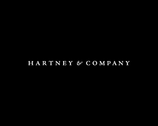
We started with the logo to determine our design vocabulary. Nathaniel wanted a strong, classic and sophisticated logo that had "no frill, no gimmicks." In the end, we designed a logo that has that classic feel utilizing both a serif typeface and an ampersand. The idea of keeping the logo black and white delivered that clean, strong, sophisticated, look.
As seen on:
hartneyandcompany.com
Status:
Unused proposal
Viewed:
7394
Share:


Lets Discuss
Yes, sophisticated and institucional. Great work
ReplyThanks! appreciate the compliments. Unfortunately this design wasnt used. Client didnt want an icon based logo, but as part of the process, designed one just incase!
ReplyPlease login/signup to make a comment, registration is easy