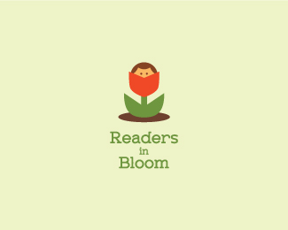
Readers in Bloom V2
by lumo • Uploaded: Nov. 19 '10

Float
(Floaters:
33 )
Description:
Version 2. Made a few modifications and changed position.Version one HERE
As seen on:
golumo.com
Status:
Work in progress
Viewed:
6566
Share:


Lets Discuss
Ahh, so cute! :)
ReplyMaybe the lowercase 'r' should be a little shorter.
ReplyThanks bitencourt**Thanks joe - I see what you mean.
ReplyI like the colors, I can see a reader!
ReplyCute.
ReplyHA! Clever and very cute. This one's a keeper.
ReplyThanks raoul and atomicvibe.**vintage - the font is Zolano Serif.
ReplyFor me one of your best mate! Although I think I prefer the other version, with the type on top of each other, even more :)
Replythanks tomme. Not sure which one I like better. Both seem usable depending on the application.
Replybest.
Replythanks ivan.
ReplyMust agree, very cute!
ReplyVery nice, lot of fun
Replyappreciated tass and ethereal.
ReplyPlease login/signup to make a comment, registration is easy