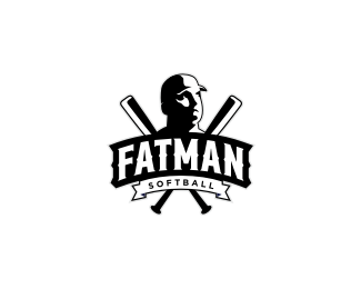
Fatman Softball
by Rokac • Uploaded: Nov. 18 '10
Description:
Second concept for a softball team from Boston. Approved:)
As seen on:
-
Status:
Client work
Viewed:
5080
Share:




Lets Discuss
Congrats buddy, that's a very solid work.
Replyliken this one also, rokac.*curious on the thin gray stoked line on the right side of the face, just curious if the line should be black to match the other thin lines, like around the bat and line work around the bottom ribbon. Looks good just wondering.
ReplyMikey might have a point there, I was curious about it too, if this is either shadow or outline.
ReplyThanks a bunch Milosz and Mikey.*You're right guys about the line, I'm on it:)
ReplyUpdated. What do you think fellas?
ReplyDefinitely better Roko. Big thumb up.
ReplyThanks Milosz. I always enjoy your feedback and support buddy:) *Btw I getting a softball t-shirt from the client with %22Rokac%22 and the number %227%22 on the back:) The whole project was a great fun.
ReplyThanks Alen. Actually they weren't quite enthusiastic about the first concept (too soft, cartoony). This one was chosen. Honestly I would rather have a t-shrit with the first one, but hey, this one will also do:)
Reply%5EHaha, good one Alen:)
Replyi kinda like this one more. it has a certain look. :)
ReplyThis ended up looking great, rokac. It'll look great on the shirts. I did like them both, so they couldn't have gone wrong either way.
ReplyStelian %26 Mikey I really appreciate your thoughts guys:)
Replylike this one Roko ...
ReplyDanke schon:) I'm still waiting for the t-shirt.
ReplyPlease login/signup to make a comment, registration is easy