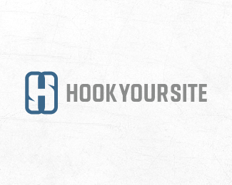
HookYourSite
by effendy • Uploaded: Nov. 11 '10

Float
(Floaters:
18 )
Description:
WIP: Logo for start-up india web based development company. SUGGESTIONS NEEDED!
Status:
Work in progress
Viewed:
2966
Share:

Lets Discuss
nice one
ReplyThanks Alex! What typeface suits best with this mark and any suggestions on mark ?
ReplyI like the overall shape of this one, the two colors could be better seperated. At the moment thei'r kind of melting together so the form of the hooks are not that visible, maybe it's just me and my lcd screen %3B)
ReplyLike the design, I think it is appropriate: http://www.dafont.com/bebas.font?text%3DHookYourSite
Replylove the mark buddy
ReplyLike it !
Replyamazing work !
ReplyPlease login/signup to make a comment, registration is easy