Blue Moon Market
by 82design • Uploaded: Nov. 05 '10
Description:
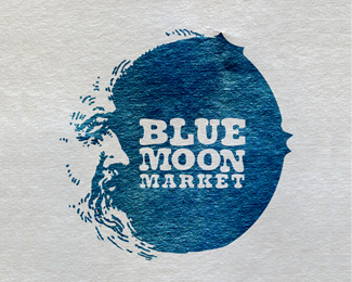
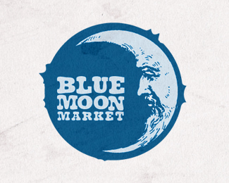
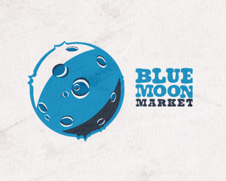
Blue Moon Market Logo Concepts for a Company that host multiple events a year selling chic home and fashion products. Hence the Blue Moon reference - Once in a blue moon.
Status:
Work in progress
Viewed:
5668
Share:
Lets Discuss
Beautiful! Only suggestion would be to mess around with the duplicate characters so they aren't identical. This style suggests that they wouldn't be. Love the texture and etching style.
ReplyI considered that as I was making the type, but for another reason... Great point though. I will most likely follow your advice.
ReplyThis is great! I love the implied shape, and your u of texture is spot on. Subtle, but it adds a lot to the solid area of blue. I agree with micha, I'm always looking for duplicate characters, and having two m's and two o's adjacent to each other does leave room for a nice final touch. Beautiful work though, I keep looking at it and smiling.
Replywow!!! very cool!
ReplyFantastiC!!!! I love the use of negative space.
ReplyFeatured here:
Reply20 Creative Moon Logo Designs for Inspirations
I think this a great looking series. I'm surprised they've flown so low under the radar...
ReplyPlease login/signup to make a comment, registration is easy