Bently Holdings
by bradyjfrey • Uploaded: Jun. 08 '07

Description:
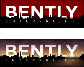
New Logo design for Bently Holdings. The intention is to steer away from the hand-holding-globe symbolism, and create an identity that embraces their green status. The reverse yin/yang is a homage to their eastern interests (such as their Ayurvedic Spa Kamalaspa, I did the site design not the logo), with a subtle silhouette for all things Apple. New designs for all their work coming soon.
As seen on:
Bently Holdings
Status:
Client work
Viewed:
7701
Share:


Lets Discuss
i like this a lot.. very good bradyjfrey
Replygood idea,nice logo
ReplyWow. I like the yin yang and also the crispy colours!
ReplyThanks for the compliments everyone:)
ReplyBeautiful.
ReplyExquisite detail. It looks like the ITU Climate logo.
ReplyThat's the first time I've heard about ITU's logo, thanks for the heads up kit! That wasn't my inspiration, more so the Yin Yang and the silhouette of the Apple logo, but it's interesting to see the same thought process. I expect to see more of that as 'green' becomes even more of a significant trend- and 'holding' the planet is not the most original of theories, so I can't complain:)
ReplyPlease login/signup to make a comment, registration is easy