Bearable Winter Gear
by Mikeymike • Uploaded: Oct. 22 '10 - Gallerized: Nov. '10
Description:
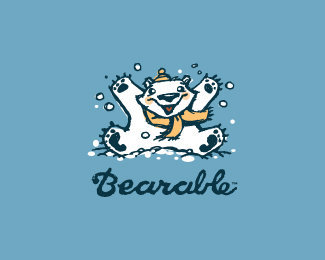
WIP. Still rough, but wondering if this works? Name may change.
Status:
Work in progress
Viewed:
5561
Share:

Lets Discuss
Love this fella! How about another type Mike?
Replygood work
Replyfantastic character :)
Reply%5EI think that type is not quite right here.
Replywell, this was a rough, so now I know that the big fluffy, cuddley feeling type is NOT the route. :)%0D*thanks for the feed back.
ReplyI will work on the type and re-post today, hopefully. thanks everyone for the comments.
ReplyUPDATED%3E different type. work any better?
ReplyMikey, I think the light blue is clashing for one. Maybe white or the same dark Blue and with the outline style I think you could use a more fun scripty style type here. The outlines are of bear are strong and the bold type you have are just not working in my opinion. Spontaneous response.
ReplyHey, thanks, Mike. I was already back working on the color. I think I loaded to quick. As soon as I saw it on LP it looked wrong. I was going darker with it.*Interesting on the script type. You may be right, I will look more into that direction.*thanks a lot, man.
ReplyUpdate. darker type. Still looking at different font directions. thanks.
Replygreat illy mikey, love it.
ReplyUPDATED: What do you think of this type? just curious. Its a rough looking script, but I feel it matches the rough playfullnessof the illy. thoughts?
ReplyPersonally, I like this type.
ReplyAnd I like your comments, Logoboom. :)
Replygreat upd!
Replythanx, ivan.
ReplyI didn't see the type before the update, but I think it is a good fit currently. Playful and casual, but without feeling accidental. Nice mark. %5Efloated
ReplyThanks, Alexander. the type before was a slightly modified Gill Sans bold.
ReplyThanks for the floats, peps. :) I think I feel more comfortable with the type now.
ReplyUber cute Mikey:)
Replythanks for the comment, Rokac. appreciate it man.
ReplyMike, i can be killed by saying this: this urges require, tremendously, a custom type - why? because the type is too bold, too heavy, too obstructing the beauty of the bear icon, also it is composed of rounded curly shapes, not in a million years this will match the bear style.. The bear is too sweet, so are the lines and colors, the drawing style. And get rid of that tag line or make it a different type.*might be too aggresive but i care about the bear:) oh, just ignore me, Mike, just speakin too much.
ReplyThanks for your poonters and why, myway, I'll see what turns out of this. Thanks for taking the time to comment.
ReplyUPDATED. took off the tag line and thinned the type type down just a tad.
Replywhat do you think? did the thinner type help? curious.*thanks.
Replymissed this somehow, the type is a match imo, great work
Replythanks, Florin. Like the look of your new personal logo, by the way.
ReplyThanks for the gallery post. Truly an honor to make it here.
ReplyReally cute!! The type match perfect IMO :)
ReplyThanks, Mr. Oronoz. :)
Replywhat a nice ilo style! great work!
ReplyCool beans MB.
ReplyThanks, deiv.*Like beans, jp. :) thanx.
ReplyWell done Mikey is just beautiful!
ReplyGood stuff, Mike, love it!
Replythanks, Gustavo.*thanks goes out to you too, Sean. :)
Replylove it
Replythanks, Danny.
Replyyeah! nice logo!_)
Replythanks, kirill. :)
Replythis is better Mike. thanks for saving the bear:D
Replythanks, myway. appreciate it.
Replynice words, Radhacelis, thanks.
Reply:) thanks, alen.
ReplyCool. Floated and faved.
ReplyThanks, Kevin.
ReplyPlease login/signup to make a comment, registration is easy