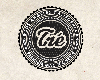
Tre Mac N' Cheese
by emesghali • Uploaded: Oct. 21 '10 - Gallerized: Feb. '11

Description:
a premium mac n cheese company. version 2
Status:
Work in progress
Viewed:
20696
Share:

Lets Discuss
Wow, so detailed, beautiful.
ReplyLOVE it! Has a nice retro feel to it. Nice work.
Replyyummy! nice detailed work indeed.
ReplyI would buy that mac n' cheese, Really nice work!
Replyappreciated:)
ReplyNice work!! :)
ReplyThey are both great logos! Hopefully the client picks one and doesn't monkey with it. Nice work!
ReplyPersonally, I like this one. The other one's type looks a little....well, cheesy. :) Good stuff!
ReplyNice logo, man!
ReplyThis is amazing.
ReplyI think it's a bit too overloaded with elements. Dunno where to look here :( Totally heavy to the eye, is it supposed to be Tie or Tre? Tire company, agriculture, wood industry maybe, but somehow I need fast food logos to make me hungry and raise my appetite for some snack. Didn't happen here........ But please, it's just my personal opinion, honest but personal, so hope there's no hard feelings :)
Reply%5EAgree, take out a few rings and give the circular type some breathing room.
ReplyI think the %22busyness%22 adds to the charm. It makes it have that classic feel. My only suggestion is to take out the fine lines behind the name. Just solid black is good. I did read Tie at first. Maybe move the tick above the e more to the right.
Replythank you so much guys for all the feedback! cant believe it made it to the front page! all your suggestions are being considered since the final branding package isnt done yet. woohoo!
ReplyYes, nice but a little over designed. Makes it hard to read IMO.
ReplyLooks like the FDA stamp to approve meat quality, jk, good job ehsaan!
Replycongrats mate. amazing artwork.
Replyit's rotating!
Replyyeah i noticed that too, raja.
ReplyI agree with GreenInk, I like the busy-ness. I'd try to keep it as is. Though making the background solid is a good suggestion. If you wanted to pull it back halfway to that, though, you might consider just making those diagonal lines solid, not dashed. But keep the same pinstripe look. **Great execution and no matter what the feedback, this is a logo to be proud of.
Reply%F3timo trabalho!
Replywonderful!
ReplyGreat badge!
ReplyPlease login/signup to make a comment, registration is easy