Coffee Night 2
by azdesign • Uploaded: Oct. 17 '10 - Gallerized: Oct. '10
Description:
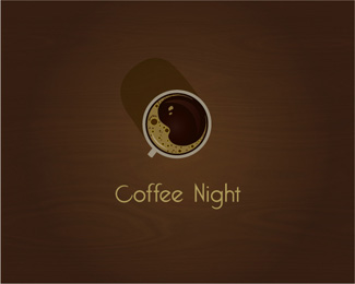
Another version of coffee night. Not sure about the type..
Status:
Just for fun
Viewed:
109779
Share:


Lets Discuss
but the moon is so cute! amazin!
Replythat's great.
Replygo to sleep coffee...
ReplyVery-very nice!
ReplyAs an illustration it has a lot of atmosphere, god job.
ReplyThanks for the comments and floats. Glad you like it.*Any thoughts about the type?
ReplyNo shadow for me.
Reply@milou*Thanks for the comment. I'm kind of fond of shadow at this point. I'll see in a few days how will I feel about it %3B)
ReplyBrilliant mark!
ReplyNice one.
ReplyRudy,firebrand - thanks guys,I really appreciate!
ReplyThis is well-executed. Nice work.
ReplyGreat Artwork and Logo!
ReplyI do like it a lot, only the ear of the cup seems a bit small?*Nice work!*
Replywell done. very nice.
Replymoon really nice..
ReplyGreat concept!!!
ReplyJoePrince,logoses, shade, Mikeymike, sby lumavine - thanks a lot! glad you like it :)**@shade3891*Never thought about it..but thanks for the thought. I'll try with bigger one
ReplyThis is definitely the winner!! Awesome concept!!
ReplyIt is awe inspiring. So good!
ReplyYeah!*You have done it !*I said before,that this idea is really good %3B)*
Replyoronoz, theartistt, ALL4LEO - thanks guys!** @ALL4LEO Thanks for the input earlier. I appreciate %3B)
ReplyNice work, really soothing :)
ReplyI think the execution of this is wonderful, but the concept is very similar to this%3B**http://brandstack.com/logo-design/details/7659
ReplyYes the execution on this one is great. There's also one on LogoLounge called Java Moon.
ReplyI see moon and other strange head, they are looking at each other
ReplyThanks for the comments guys and for the gallery spot!!* *@square69*thanks for the info. Yes you're right. The concept is, unfortunately for me, basically the same. Honestly I've never seen this logo before. *This is not WIP, neither I'm trying to sell it or anything, so I guess it's no harm done... or is it? :(**@firebrand* can you provide a link on a Java Moon logo please? **Never the less thanks for your comments!
ReplySure. **http://twitpic.com/2zk62w
Replyclever idea, Andrea! :) yeah...no shadow i think..
ReplyMind blowing work :)
Replysuperb execution, congrats!
ReplyWell deserved gallery spot. Congratulations!
Replybeautiful
ReplyAnother example of what has been done already. Anyway this cup is great.
ReplyNice! Thou, the handle looks alittle small and there is no reflection of the handle! apart from that I like the concept! :)
ReplyI dont like the type but the logo is great.
ReplyAgree with brandclay
ReplyYou are right, i think you need a stronger type but its great
ReplyGreat idea. I think you should either go for a more dreamy or strong font.
ReplyThank you all a lot for your comments and suggestions. I appreciate a lot!!*I will definitely try with some stronger type
Replyvery nice!!!!!!!!!!!!!
Replythanks trofdot!
Replyfontasteeeek
ReplyI think this is great. Yes, it's similar to a few that have been referenced, but IMO, this one is way more successful in execution. Those others felt like the concept was being forced, whereas this execution looks natural. I'm not bothered by the type as others have been. To me, it has a gossamer, wispy-like presence that lends itself perfectly to the feeling of %22night time.%22 Nice work.
ReplyThanks atomicvibe. That's a really nice comment!
ReplyLove the moon-coffee mark. The shadow casting left gives the illusion that the weakish type is slightly right of centre. The 'N' particularly looks scrunched compared to the very open 'C'
ReplyI say : Top, top ! (and I do clap, clap)
ReplyLove this mark!
ReplyThanks a bunch guys! Plan to change the typeface soon :)
ReplyAmazing %3D)
ReplyBrilliant! I've seen this before and now I comment on the designer. Good Job
ReplyExcellent work! the execution does perfect justice to the concept :)
ReplyPlease login/signup to make a comment, registration is easy