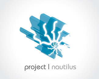
by pnautilus • Uploaded: Jun. 07 '07
Add to Pad (In 2 Pad s )
Description: topo idea Status: Nothing set Viewed: 7271 Share:
Love this, both the mark and typography work well together. The only suggestion I would make would be perhaps enlarging the typo to be more cohesive with the mark. Otherwise great work!
Clever design, but I do agree with tj's comments. All in all, nice job!
I agree with above, but would add that there needs to be more contrast between the logo and the background. Blends in way too much.
Please login/signup to make a comment, registration is easy
Follow


Lets Discuss
Love this, both the mark and typography work well together. The only suggestion I would make would be perhaps enlarging the typo to be more cohesive with the mark. Otherwise great work!
ReplyClever design, but I do agree with tj's comments. All in all, nice job!
ReplyI agree with above, but would add that there needs to be more contrast between the logo and the background. Blends in way too much.
ReplyPlease login/signup to make a comment, registration is easy