Arthur Browns WIP
by vld • Uploaded: Oct. 05 '10
Description:
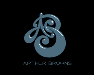
Logo for Arthur Browns. Music producer. First attempt.
Status:
Work in progress
Viewed:
4631
Share:

Lets Discuss
I would appreciate your opinion on mark legibility. Thanks!
Reply%5EI agree the the 'A' isn't instantly recognizable, but I think it is more important that the 'B' is visible...after all, that is what the last name begins with. I like it.
ReplyThank you guys. I was afraid the A isn't prominent %0D* enough...
Reply... update.
ReplyMark is great, but the type seems a bit outta place here...
ReplyThanks milou! I'm still looking for a good typography here...
ReplyI love the look of this but I can't quite see the B...
ReplyThanks Alen and James!%0D*@James: I thought that the B is first thing to see... ):
ReplyIs beautifully drawn.)
ReplyThanks Gal. Much appreciated.
ReplySounds greeeeeeat!
Replyhehe... Thank you Pavel. I'm working on new proposals for this client.
Replythanks bro !
ReplyI love it, but to me the B is not easily seen. I missed the first attempt when people were saying the A didn't stand out.
Replyi love it :D
ReplyPlease login/signup to make a comment, registration is easy