room
by Rokac • Uploaded: Sep. 23 '10
Description:
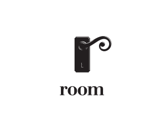
Combining letter "r" with door handle.
As seen on:
-
Status:
Work in progress
Viewed:
11758
Share:




Lets Discuss
well... the first documented invention of the door handle appears in U.S. Patent entries for the year 1878 when a patent for improvements on a door-closing device was issued to a man named Osbourn Dorsey.
Reply@nido*Haha... *Have you read the whole article? *Quote: %22What did people do before there were doorknobs? Quite probably, a lot of things.%22*:)
Replythat's quite a nicely executed door handle.
Replyhey roko I really like the idea and never seen it has been used allready. how about some typework next to it?
ReplyIs there an R in there? Nice style.
ReplyStelian, Andrej, Tony, Tass, thanks guys!*@Andrej*Cheers buddy, working on some type right now:)*@Tass*Yep, that's the key idea:) Combining letter %22r%22 and a door handle.
ReplyAdded type, your thoughts guys?
ReplyA well-executed and fun identity, Roko!
Replytype looks nice but layout and alignment gonna raise some problems here, i believe
ReplyBronte, Pierro, Stelian, thanks you folks.*@Stelian*I definitely agree with you buddy, layout needs a different approach. Will work more on it. Thanks again for your input:)
Replythis is turning out real nice, man.
ReplyThank you Mike!
ReplyBeautiful!
ReplyThanks Daniel.
ReplyPerfect, as always Rokac. Nice work!
ReplyMarvin, thanks a lot buddy!
Replythis is nice
ReplyThanks Colin!
ReplyThis is nicely done Roko. I wonder how it looks if the keyhole of just white.
ReplyThanks for the kind words and your thoughts Riz. I did with the whole keyhole in white, but then the it's getting to much attention if you know what I mean.*Cheers.*
ReplyI dig the subtle highlights. But I think rectangle portion of the mark probably needs to be centered. It has so much visual weight. Dunno.
ReplyGlen, thanks for your input.*I've tried that, it doesn't do the trick. I think the whole layout needs a different approach. Everything looks a bit unbalanced. Just have to spend more time with this one:)*
ReplyIts a powerfull design really but you're right.. something needs to better. :) agree with Glen too... The rectangle needs justification maybe. Love the design though!
ReplyThanks Riz..Btw. I've centered the rectangle portion of the mark just as Glen suggested. I think it works better now.
Replythis is still one of my favs...
ReplyI know what your intention was ... but I see also a very strange head ... keyhole is the smiling mouth ...*and the door handle contains an eyeball ... aiens are everywhere ... %3BD
ReplyColin, TaS, thanks lads!*Yeah, there's an alien inside the room:)
ReplySuper concept!
ReplyPlease login/signup to make a comment, registration is easy