Banjo Cat 2
by randyheil • Uploaded: Sep. 23 '10 - Gallerized: Jun. '12
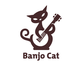
Description:
A revision as suggested by many.
Status:
Unused proposal
Viewed:
9338
Share:






Lets Discuss
A revision that I'm happier with. Thanks for the suggestions.
ReplyI think it looks much better but perhaps you could follow the contour of the banjo and flip it outward, the other way. It would balance better with the hand?
ReplyI still think the tail doesn't need to come outwards... imagine it as a reversed s perhaps, running up along the side of the cats body... but not as curved as an s though... have it compliment the out line of the body somewhat... when you have it out the way as you have now, imo, it throws the whole balance off...
ReplyRandy something like this IMO. http://twitpic.com/2r9d6i
Replyand work on that right side hip make it follow the banjo better. Just my opinion. I really like it or would not have bothered :) I think Nav's thinking the same thing.
ReplyI agree with nido's comment. Looks as if the tail was an afterthought where it is right now. Tie it in more continuously with the body curves. Very nice though.
Reply@logomotive: excellent solution, which significantly balance the mark
ReplyIt was Nav's solution, I just took the time to visually explain it. Hope you don't mind Randy.
ReplyI'm trying to retain the symmetry of the hips, and I'm hoping to find a solution where the tail and hip are clearly distinct from one another.
ReplyIt's great as is, ship it.
Replyi like the tail as is, it provides a nice balance for the arm and, IMO, looks better than the suggested revision, since the revision reduces the hips and changes the shape of the cat.*nice work!
ReplyOK Randy, I understand. It is really cool regardless of any opinions. Makes me smile.
ReplyGreat work Randy...specially like the way you have used the tail..V
Replywhat a lovely cat! its great!
ReplyPerfect logo! Cat's tail and left hand, in effect, maintain the balance. Lovely!
ReplyVery nice.. i love it.
Replyvy ebanulis' s etimi soc seti'ami!
ReplyIa prosto rabote hochu postavit'!
tochno - ebanulis'
ReplyHey, I remember this. Turned out nice.
ReplyPlease login/signup to make a comment, registration is easy