Tango de Tightrope
by DoubleA • Uploaded: Sep. 15 '10 - Gallerized: Nov. '10
Description:
Self promo
As seen on:
Doubleacreative
Status:
Client work
Viewed:
23800
Share:






Lets Discuss
this is so nice!
Replywow, outstanding design!
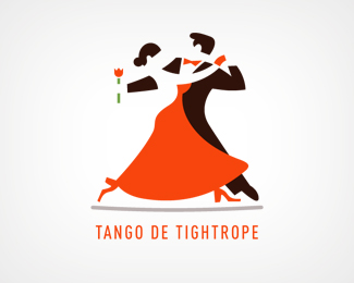
Replyvery amazing, you see the body's so well in the negative space. And it has great flow and movement. nice.
ReplyThx guys.
Replygreat work, your drawings skills are very good
ReplyAmazing negative space play! Great job!
ReplyAbsolutely adorable! Glad to see it in the gallery.
Replygreat negative space, really love this. congrats!
ReplyOutstanding illustration!
Replyhow do i hire you to create a logo for me?
ReplyMan it's georgeous!
ReplyThx everyone. I really appreciate your comments.
ReplyBeautiful, great use of negative space.
Replyfantastic!
ReplyI've seen a lot of these self-promos of yours, and I love all of them. Are there details on these promos somewhere on your site? Case study? Fantastic work.
ReplyBeautiful work mate. Really nice.
Replygreat illo!*You've really captured the movement and poise of the dance.*My only niggle would be the text is pretty small - if it is used as a 'proper' logo. Reduced down to a business card etc, and the text will probably be a little too small.
ReplyFC and Anthony, I don't have anything on my website for this stuff. It is something I am doing in my free time so its been a slow moving process. But basically what I am doing is a logo for ever letter of the alphabet which will eventually go on a self promo poster for my freelance company. I am about 3/4 of the way done.
ReplyMachine, thank you for your comment. I agree with you. I actually just added the type to show for the website. When the project is finished the logo will be displayed without the text.
ReplyYou have an excellent approach to branding. I mean, every letter!? Wow. What font is that, by the way? Looks incredibly familiar.
ReplyThanks JF, ya some of the last letters are proving to be a difficult : ) The font is Din.
ReplyNice use of negative spaces here and there.
Replythis is gorgeous!
ReplyThanks guys.
ReplyI really really like this design! it is awesome!
ReplyThis is sweet! I wish the orange was more red. But totally awesome design!
Replyit's awesome!
Replyja nice for a tango presentation!
Replyvery well
ReplySo elegant and stunning ) Love it!
ReplyPlease login/signup to make a comment, registration is easy