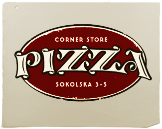
Primo
by hyperborea • Uploaded: Sep. 07 '10 - Gallerized: Sep. '10

Float
(Floaters:
87 )
Description:
Logo done for the pizza house. Rejected from the client. Is it readable/legible enough? Cause I like it...
Status:
Unused proposal
Viewed:
11860
Share:


Lets Discuss
I can understand the client thinks it's not legible enough, apart from that I think it looks nice. I wonder if you need the shadow and gradient however.
Reply%22P%22 is quite unreadable the rest looks fine.
ReplyThanks for the comments guys. Yes I thought that P is a litle bit of an issue. But I really intended to make it original and unique. And speaking of shadow and gradient, yes I agree they don't need to be there, just a way of presentation...should I get rid of these.
ReplyI like it, but feel you could detach the P connecting to r and that would work.
ReplyReally cool typography mate :)
ReplyThanks again for comments and floats.*All suggestions accepted and here's the logo update.*logomotive I guess you were right.
Replysplendid!
Replythanks tomme, and thanks for the gallery spot david!
ReplyReally nice mate!
ReplyWell deserved gallery spot :)
Replysweet!
Replywhen the P was connected to the R in initial design, I was able to see it as %22Crimo%22 sometimes. after logomotives suggestion to detach them I think that's solved problem. But never saw %22Trimo%22...thanks for your input Alen, hope that's just you...
Replyreally like this, nice one!
Replyyess its Trimo in thumb but working..:)
ReplyI think it%60s awesome **%3Ca href%3D%22http://cvresumewritingservices.org/%22%3Eresume service%3C/a%3E*
ReplyHooray!
ReplyI read Primo immediately... not so much because I saw the 'P', but more because I read 'rimo' and my eyes filled in the gap based on the general shape.**I think it's fine, and actually lovely.
ReplyLooks Primo now.
ReplyEXCELLENT work.
ReplyThanks to you Mike!
ReplyWorks for me. Beautiful!!
ReplyThanks jippy, your work is great!
ReplyNo problem reading it. Very, very nice!
Replyi like it, it very cool!
ReplyI was able to read it without a problem. Nice work. :)
Replyugh...this is gorgeous. the client missed out on a timeless trademark.
ReplyThanks Glen, glad you like it.
ReplyThis is one gorgeous logo. Whatever did the client end up choosing?
ReplyOvo ti je super Andrej. Ima taj neki flow u sebi. Cheers :)
ReplyHa! Nisam znao da smo zemljaci covece! Thanks!
ReplySkoknes do profila i vidis. Simple as that.
Replyyeah... big shame it went unused... brilliant stuff.
ReplyThanks nido!
ReplyGreat one indeed! Smooth and flowing :)
ReplyCheers Panko!
Reply%22Rejected from the client. Is it readable/legible enough?%22**It is an awesome logo.*At first sight is a little hard to read, but only for a few seconds, and i dont think this should be a major problem.
ReplyVery nice logotyp :)
ReplyHas read trimo, but as a whole looks very much even it is cool
ReplyPlease login/signup to make a comment, registration is easy