Milford & Sons
by joelalexander • Uploaded: Sep. 05 '10 - Gallerized: Sep. '10
Description:
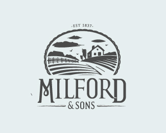
Milford & Sons organic dairy farm -- updated.
Status:
Nothing set
Viewed:
15533
Share:

Lets Discuss
superb illustration. maybe make the Milford word smaller:p it distracts attention from the illo.
ReplyI like it.
Replyyes, love the illy, type smaller and with bigger kerning imo
ReplyThanks for the comments guys, really appreciate the feedback, think I may play with the type a bit more on this one.
ReplyAgree with others about the type.*Illustration is great with that linocut style!
Replygreat illustration and type...it perfectly fits together
ReplyFeels so authentic! The client must be thrilled.
ReplyLove the illustration! Agree with most everyone else on the Milford type. It's too much of a mark on it's own. Something simpler would compliment the mark.
ReplyThanks for the gallery spot and floats! updated as per dotflo's comments - I felt this worked well and agree that the type in itself felt like too much of a mark. By making the Illy slightly larger and kerning the type has overcome this. @mabu - thanks yes the client is thrilled and thanks for your comment, am a massive fan of your works!
ReplyI'm sure this has lost some floats recently!?
ReplyVery beautiful landscape
ReplyPlease login/signup to make a comment, registration is easy