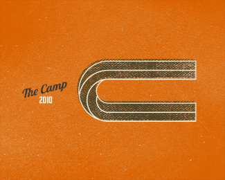
The Camp
by mabu • Uploaded: Sep. 04 '10
Description:
Just a little something I've been working on.
As seen on:
http://mabu.dk
Status:
Nothing set
Viewed:
3562
Share:
Lets Discuss
I love the texture in the background and colors! have you tried it with The Camp 2010 under the C? Looks great!
ReplyAppreciate it man. I've actually already tried that, but it didn't really work. I should mention that the logo is designed to fit a sign that is a tad wide, so it felt natural to explore a horizontal design instead of the standard vertical solution.
ReplyLooks awesome! That retro illustrative style is really spot on.
ReplyCheers lumavine.
ReplyThis brillinat - Love it - The colors, the roughness, the artistic tendency - to much of over ornamented logos around...
ReplyLove your use of lines. Very optically pleasant in the same way as Escher or a mobius strip. Texture complements form extremely well.
ReplyPlease login/signup to make a comment, registration is easy