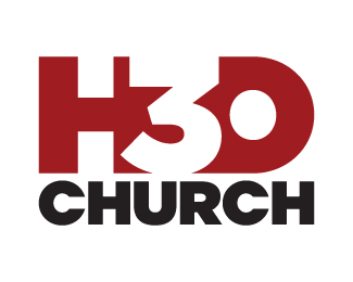
Bays!de Community Church
by cobaltcow • Uploaded: Aug. 31 '10

Float
(Floaters:
0 )
Description:
Client needed a modern, clean rebrand representing community & life.
Status:
Nothing set
Viewed:
1645
Share:


Lets Discuss
Interesting! I would simplify it a bit to keep it clean and modern. Fewer dots, and simplify the border - or loose it all together. Good start!
ReplyI agree with the comment above. I'm also not sure how I feel about the %22Coolvetica%22 type. That font always looks retro/70s to me, so I'm not sure if it's appropriate for this.
ReplyAppreciate the comments.**Yeah I'm not convinced with the Coolvetica either, but I liked that the tail on the y wasn't hanging out there.**The border was added at the end to add some balance. I guess dropping the name back to lower case would help balance that.**It's only a 3rd string option for this one but I'll keep playing.
ReplyDid you do all the dots yourself, or with a brush?
ReplyAny time I see a logo like this, I think of Anti-Particle. Even if I didn't, I'm not entirely sure it captures the feeling of a church. Good luck though!
ReplyI'd have to agree with Chad about the Anti-Particle logo.
ReplyI'll have to check out anti-particle..**Yep I did every circle individually. I've redone it with fewer %26 larger bubbles, just working on the type and I'll upload it for review.**Thanks for the feedback.
ReplyPlease login/signup to make a comment, registration is easy