Logofolio
by Logomotive • Uploaded: Aug. 24 '10
Description:
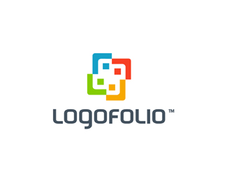
Logo designed for Logofolio, which is a Premium WordPress Portfolio Theme designed by logo designers for logo designers. With Logofolio you'll be able to share your work with the world in style. Unlike other themes, Logofolio is targeted specifically to logo designers. We've made the theme easy to use, customizable, and structured to help you land more projects.
As seen on:
www.logomotive.net
Status:
Client work
Viewed:
7092
Share:



Lets Discuss
looking good
ReplyFirst logoholik, than logofire, logopedia, logomedia and logofolio.
Reply%5E?**Description sounds nice Mike. Nice type here.
ReplyLooking forward to see more of this project.
ReplyThanks! here's a little sneek peak http://www.logomotive.net/logofolio-sneak-peak-a-premium-wordpress-portfolio-theme-for-logo-designers/
ReplyInteresting initiative Mike, let us know when it is running, I'll like t join.
ReplyAwesome design, mike :)
Replylooks great Mike. Does this mean we're all going to have identical looking sites soon? %3B)
ReplyCheers. @ birofunk, no not at all. You'll see as soon as it's released :)
ReplyI love: 1. the idea, looking forward to hear/see more about it%3B 2. the type treatment and 3. how you sneaked in L%60s in the symbol. I hate: 1. stylized ppl-like shapes circling around, would avoid that way overused and most obvious direction for something like this, especially after reading on your site more about its main purpose%3B 2. first and, again, the most used 4 color scheme.
Reply%5E good observations Wizemark. Yeah the human aspect is kind of an accident but Like the fact it does come out. The squares or 'heads' here represent 'logos%22 also. I tried to bring out the L and F also. As far as color goes I can buy your thoughts. probably on each release of new themes will also be a new color theme. Thanks for your valued opinion.
Replylove your work, Mike. site looks interesting.
Replygreat looking forward to this project!
ReplyThanks Mikey, Right back attchya.*Thanks logtivity. This project will be perfect for UNtechy logo designers like me :)
ReplyThe more I see this logo the more I like it. Nice work!
ReplyThanks Nicelystrange. I feel the same way:)
ReplyThanks Gravitart, been a lot more work than meets the eye. :)
ReplyLooking forward to learning more about this, being an UNtechy logo designer myself.
ReplyThanks jerron, I wish someone would have done this Like Ten years ago :)
ReplyMike, any sneak previews?
ReplyWell a little more info here. http://www.logomotive.net/logofolio-sneak-peak-a-premium-wordpress-portfolio-theme-for-logo-designers/**Don't know how to do that clicky thing cause I'm UNTechy. :)
ReplyKudos for putting something like this together, the logo does grow on you the more you look at it.
Reply%3Ca href%3D%22http://www.logomotive.net/logofolio-sneak-peak-a-premium-wordpress-portfolio-theme-for-logo-designers/%22%3EClicky Thing%3C/a%3E %3B)
ReplyThanks Bransimplicity.*Ha Steve yeah that click thing.
Replykind of agree with wizemark on the color scheme. I just can't get past the fact it's so overused. otherwise, i think it's great.
ReplyThanks Paul. Coming from logo designers and it being geared for logo designers, a very valid point. Might look into mixing the color up after more thought.
ReplyPlease login/signup to make a comment, registration is easy