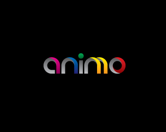
Perry Cross Spinal Research Foundation
by VERG • Uploaded: Aug. 16 '10

Float
(Floaters:
12 )
Description:
An inspirational motivational speaker, i designed this logo for Perry for his spinal research foundation. The icon is meant to represent the spinal nerves crossing and weaving. The green cross represents his surname which has always been part of his brandmark.
Status:
Client work
Viewed:
3056
Share:


Lets Discuss
i like the dynamic of this, im not sure if the mark is to high
ReplyThe actual logo that got approved had the icon horizontal. They also had all the copy the same size on one line which i didn't like.
ReplyVery interesting and eye catching mark.
ReplyGood work even if I'm clearly not convinced by this layout...
ReplyThanks Rokac and Thomas. Thomas, i'm happy for you to elaborate on the layout and suggest your thoughts.
ReplyFirst, mark is too big comparing to type. Black background... Not sure (makes me thinking to xbox, why not some green-blue like your avatar's background, plain and softer, or white and some %22medical%22 green)... Type's tracking is slightly too tight or type not enough condensed. Myriad is fine but you may try Myriad Condensed, slightly boder. Even if it talks about %22spinal%22, I'd have probably tried to put it horizontally, just above %22cross%22 or vertically as some kind of exponent of the text (Perry Cross%B2).
Replythanks for taking the time thom to throw me some feedback. I'll post the logo that got used, as mentioned earlier i didn't like it too much in the end and thought this was the stronger option. i'll also have a play around with your suggestions as i think they're all very valid.
Replythanks femili
ReplyPlease login/signup to make a comment, registration is easy