ZEBRAND
by vasvari • Uploaded: Aug. 16 '10 - Gallerized: Jul. '13

Float
(Floaters:
45 )
Description:
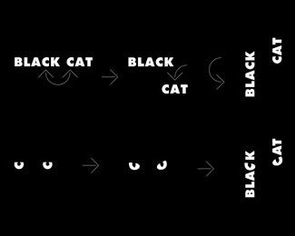
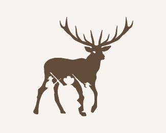
My "Zebrand logo" featured in 2011 LogoLounge Trends Report.
Logo design for a branded shoes retail company, Hong Kong.
Just started to setup her branded shoes retail / online business after 10 years of manufacturing and exporting for some European brands.
As seen on:
http://www.logolounge.com/article.asp?aid=lnPf
Status:
Client work
Viewed:
13158
Tags:
trends
•
2011
•
loopys
•
trend
Share:

Lets Discuss
Sweet mother of pearl this is beautiful.
ReplyThank you Todd!
Replyyeah agree, lovely job.
ReplyThe Z looks like an L to me, but otherwise spectacular.
ReplyVery unique and all fits together well. Great job!!!
ReplyThanks so much dear my friends :)*I appreciate your comments!
ReplyHey juli! Thank you :)
ReplyLove ze type!
ReplyHi Henric! Thank you %3B)
Replywow lines
ReplyHi Lady! Thank you for your attention %3B)
ReplyCongrats Peter!
ReplyThank you Nikita :) I appreciate your kindness!
ReplySo simple and wonderful. Congrats on the feature.
Replyso good, Peter ... so good
ReplyCongrats, Peter!
ReplyGreat name and logo!
ReplyThank you so much my friends, is really a great news to I return home from vacation ;-) It's great, that this logo I see in the gallery! Thanks
ReplyPlease login/signup to make a comment, registration is easy