Higher Motion V2
by lumo • Uploaded: Aug. 16 '10 - Gallerized: Mar. '11

Description:
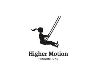
Girl version of this concept. Boy version at: http://logopond.com/gallery/detail/112798.
As seen on:
golumo
Status:
Just for fun
Viewed:
14167
Share:


Lets Discuss
Nice updates James, looks great mate. Close the space a little between O and T in MOTION though.
ReplyThanks joe. This one does communicate more motion which makes it stronger IMO.
ReplyThe idea is really nice. The silhouette feels awkward though. Something might be off with the proportions.
Reply%5EHmm...I know on the other one some people were saying the proportions looked off also. For some reason I'm not seeing any problems with it. Maybe it's time I get some new glasses :)
ReplyNice work!**I agree with the proportions comment though. The legs could definately do with being longer.**Also there seems to be little shape to the bum as it's cut off by the swing seat. I'd raise the figure off the seat, add greater curve to the backside and blend the bottom of the torso with the legs with a fluid curve (at the top where the rope comes down) so that both parts appear as a single stremiline shape.**
Reply%5E %5E Good comments. The neck head area feels a little awkward too. And something about how the hair is flowing off the head isn't right. Where's Mike or Alan when you need them? @Joe Yep, I think it's time. :-)
Replythanks ocularink and webcore for the feedback, I'm still working on it and will post an update. Keep in touch guys!
Replyupdated...
Replymuch better
ReplyI noted the update before reading the comments.**Agreed. Much better! :-)
Replythanks, I'm still tweaking but I agree with logoses that I'm liking the updated boy version more.
Replyi like the boy...
ReplyGreat stuff.
Replythanks mabu.
ReplyThis is great.**On another note, might be cool if you had it suspended from a moon. :)**Too much? Ya never know people.*
Reply%5E yeah, but the moon is more or less a trademark for Dreamworks in this industry.
Replythey dont own the moon.
ReplyThanks brandclay. Dreamworks probably think they do.
ReplyVery cool, James.
ReplyJust made some updates on this logo.
ReplyReally nice, James!!
ReplyThanks Oronoz!
ReplyThe girl presents herself way better than the boy. After all, women are prettier by nature in any possible way compared to men :).%0D*%0D*She keeps her legs up so the space between the illustration and the type seems more balanced than it is on the boy's concept. Straight winner!
ReplyOne of the changes I wanted to make is to have the type to be more consistent with the girl. I feel that this type works better than the all uppercase and gives it a softer feel. Appreciate the comment MYOB!
Replythis all fits nicely, James.
ReplyYeah, awesome logo!
Reply%5E agree
ReplyNice to see this featured!
ReplyThat's sweet work James, glad it made the gallery finally.
Replycongrats James:) great logo:)
ReplyVery nice and inspirational:)
ReplyAs others said, the girl looks wrong. Her body is out of proportion. Her motion looks stiff and unnatural. Also having her swinging in the middle of blank space looks odd. It's an interesting idea, but it feels uninspired to me.
ReplyAppreciate all the comments guys!**@Jedah, I feel that the stiffness that was mentioned has been removed and it pretty much looks like a girl would on a swing. Also in terms of swinging out on a 'blank space' looking odd: the whole point is to make it free and moving.
ReplyVery nice and clean logo.
ReplyCongrats on the gallery, this has a great feeling:)
ReplyThanks for the comments and for the gallery spot.
ReplyLove the feeling of this - I think you chose the perfect point in the swing to illustrate the movement.
Replyhigher expertise !!
ReplyPlease login/signup to make a comment, registration is easy