BOND - Hunter College Alumni Group
by AnthonyF • Uploaded: Aug. 12 '10

Description:
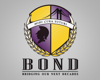
Client was looking for a regal design that also encompassed the aspects of the school and the goals of the group. A coat of arms is quite possibly the most regal design possible, adorned with Athena in the lower left and a reference to the groups motto in the upper right.
Status:
Client work
Viewed:
2121
Share:


Lets Discuss
Did you consider putting the college's logo in the lower right segment? It almost feels incomplete because of the huge hole in that corner. The addition of the college's logo would also give a point of origin as to what this logo is for.
ReplyTy for the input, i did have silhouettes in the bottom right corner, but the client chose to have them taken out. The college's logo is Athena, in the lower left corner.
ReplyHi,
ReplyMy name is Eric Yanez and I’ve recently started working on reviving the Hunter College’s BOND Alumni Chapter. Going through files and looking online, I’ve come across the attached logo. When I did a Google Images search I found the logo was found here and I wanted to contact you to find out more about the logo. I assume that you were the designer of the logo, but I wasn’t sure what the terms were for your designing it. I also noticed that a similar logo can be found on http://www.designbyforce.com/ . I'm not sure if you are involved with them in any way but if so I would like to know about that logo as well.
With that being said, I love the design of both logos and I would love to be able to use this logo in some way going forward with the reviving of BOND. Is there any chance that you have a hi-res copy of either or both logos that I’d be able to obtain?
Thank you and I look forward to hearing from you!
Please login/signup to make a comment, registration is easy