Higher Motion
by lumo • Uploaded: Aug. 09 '10

Description:
Fun concept. Any thoughts...
Status:
Nothing set
Viewed:
5050
Share:


Lets Discuss
I like it
Replythanks mude!
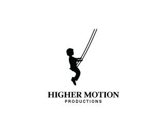
Replyit's too stiff for me and the body is way big in comparison to the arms and leg.
Reply%5E %22it's too stiff for me%22 LOL
Replyi like the idea, work more on the silhouette :)
ReplyThanks for the comments, I will be making changes to this. Will let you know. The overall concept is there thought I think...
Replymade some adjustments and made it 'less stiff'. your thoughts...
Replyummmm, yeah I think you should look at a different arrangement, I think it's still a bit 'stiff' lol
Reply%5Em2... this is hilarious. Despite our filthy minds, it's a good logo.
ReplyThanks Anthony and alex. In the update I changed the proportions somewhat and tilted the child back a little more to give the appearance that he's trying to swing higher.**I don't see anything else in the logo and feel that this is pretty accurate. Anyone else?
ReplyI think the silhouette is fine James, looks great. The only thing I would change is maybe putting a little curve in the swing chains to really show %22motion%22. Awesome concept though mate.
ReplyThanks Mike. For once I wasn't even going there. Still think the silhouette needs a little work. Little tiny hands but huge feet. The hands I can see, but the feet need to be smaller, imo.
ReplyA few (non-juvenile) suggestions: I would make the silhouette a girl with longer hair as that will help give the logo a sense of motion. I would also give the silhouette a back leg (or at least a hint of one). Finally, I recommend that you modify the swing seat to be more of a plank style instead of a harness style, which I think will also help alleviate some of the %22stiff%22 comments. Good luck.
ReplyJoe, great idea - thanks.**Don't agree that the feet and hands are out of proportion. Still doing finishing touches but I'm feeling it.**sdijock - I have been thinking about doing another like this and using a girl. I'll see. I'm liking this though...
Replyi think this logo is better than the girl-version
ReplyThe illu is freaking cool, I would match it with another type though, could be even better. Keep it up James!
ReplyThanks logoses and milou.
ReplyI like the girl version much better. More movement.
ReplyI agree - there is. I'm still working on it and fine tuning it. I think it might have more potential because of that. It's just not final yet and this one is more fine tuned. Will see once I have both complete.
Replynice work on this. I agree with you about the strange-subtle proportions and i belive that it's got a lot of message in it - i like that. though, i belive that you could work more on the type, maybe even put one line between the text and tag line and also move the text a bit to the left and maybe a bit smaller:)
ReplyIt is really good, I like more the girls one. The legs on the boy doesn%B4t seem right, I think they should be higher.
ReplyPlease login/signup to make a comment, registration is easy