Path of the Horses V.9
by kugelis • Uploaded: Aug. 06 '10

Float
(Floaters:
9 )
Description:
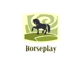
Searching for the perfect balance and trying to avoid unnecessary associations. Logo: you can see two horses - 1. the body and the head looks to the right; 2. the body looks to the left and the head looks to the right (2nd horse is looking backwards). The overall composition is presented like a path.
As seen on:
Logotipu kurimas
Status:
Client work
Viewed:
4547
Share:


Lets Discuss
Here I just see one horse, also the path looks like a mountain for me anyway the shape grabs my attention.
ReplyTwo horses and the path was an initial idea, but the final logo is not revealing it clearly...**Thanks for all of your kind comments :)
Replyveo un caballo y la verdad no necesito ver otro. Un logo de caballos simplemente fuera de serie. debo decirle que ud. me inspira, hace rato que no ve�a trabajos originales
ReplyPlease login/signup to make a comment, registration is easy