Anelor
by clairec • Uploaded: Jul. 21 '10 - Gallerized: Jul. '10

Float
(Floaters:
36 )
Description:
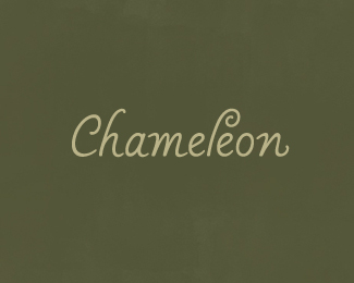
Logo for a recently renovated traditional wooden sailboat. The aim was to convey a sense of timeless tradition combined with a personal, modern feel. Design process here.
As seen on:
Behance
Status:
Client work
Viewed:
7928
Share:


Lets Discuss
dig it
ReplyThanks zu and sebastiany, glad you like it! Happy to see this in the gallery
ReplyL is pretty strange here
ReplyI like the mark and i like the colours :)
ReplyCongrats Claire, great type.
ReplyThanks all for the comments!**Actually the lowercase 'l' isn't strange at all, it's standard calligraphic practice to curl the top forward to the right. Curving round to the left would disrupt the type and then the balance of the piece. I didn't think anybody could have a hard time with legibility as far as calligraphy was concerned.
ReplyLove those lines.
ReplyNice work claire..
ReplyThis is a beauty! Loving it.
ReplyMads %26 Jippy: thanks a lot! **Vintage_chic: Yep, the idea was to give a sense of elegance by adding a touch of calligraphic-inspired style. Glad you like it!
ReplyNice flow it has – Yoda
ReplyThanks Milou! (must have been posting at the same time as you) You've got a stunning showcase.
ReplyNice flow it has - Yoda
ReplyHaha thanks a lot Rudy!
ReplyI think it's cool as is.. **but I do see what people are saying about the L as well.. I think if it were to curve the other way it'd look like it was continuing the fluidity of the A, which could be very nice.**either way awesome job and a wonderful addition to the gallery.
ReplyThanks very much Dan! Interesting point for the 'l' - I had briefly tried it the other way, but it looked as if it was tipping backwards and the '-or' was lonely!*Really like your portfolio website by the way.
Replyohh, yeah i could see it isolating the %22or%22 :/ **and thank you :)
Replybeautiful work!
ReplyBeautiful type - a well-deserved gallery spot!
ReplyThanks very much Ali %26 Gafyn! Appreciate it a lot
ReplyPlease login/signup to make a comment, registration is easy