Contre
by milou • Uploaded: Jul. 21 '10 - Gallerized: Nov. '10

Float
(Floaters:
129 )
Description:
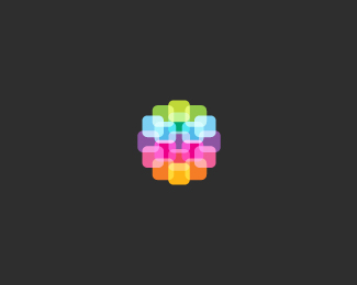
Contre is the company dealing with applications development. Mark shows the dreaming embryo.
Where ideas are born.
As seen on:
new milou portfolio
Status:
Client work
Viewed:
19103
Share:


Lets Discuss
Nice work, Milou!
Replypretty
ReplyCool concept, Milosz :)
Replyloving the colors.
ReplyGreat work!
Replyperfect!
Replybeautiful colours and mark, but i think the embryo %22tale%22 might need a little work. Type is ok too :)
ReplyEuan, Eddie, Ali, Matthew, Ben, Amir, Mathias %26 Davi - Thank you very much mates, I'm very glad you liked it, means a lot (:
Replybeautiful design, milou.
ReplyCool, Milo!
ReplySweet concept, man.
ReplyThank you my friends!
Replyso smooth and sweet, great work, milou!
ReplyMr AnthonyLane thanks a bunch.**Cheers Claude.
ReplyStylo-ish!
ReplyI'm on melancholy hill now, look for plastic tree.
ReplyWow, well executed logo with atmosphere and strong concept behind.
ReplyWow! Float and fav. I love everything in it. You're the best designer here imo. By the way mate, what font is this? %5E%5E
ReplyWow, thank you Jan, I'm glad you think so!**Hey Filipe, I appreciate it, though there are far more better designers than me here %3B)
ReplyOh and @filipev the type is called Conduit.
ReplyBeautiful.
ReplyThank you mr engar!
Replylove the concept here.. 100%25 unique
ReplyMuch appreciated SBJ!
ReplyThank you milou :)
ReplyAdorable colors!
Reply@filipev No probs.**@Alex Thank you.
Replyreally great, especially color scheme. well done milou (:
ReplyThank you Patricia! :)
ReplyReally nice milou.
ReplyCheers Dennis!
ReplyIf anyone wants to see the mark bigger I invite you here: http://www.dribbble.com/shots/39048-Where-Ideas-Are-Born
ReplyMissed this one Milosz, really nice logo buddy.
Replylovely.
ReplyRoko Paul %3D Thank you mates. I've never been good enough at maths :P
Reply(Plus is missing)
Replylovely colours :)
ReplyHey thank you Mr Deiv, I'm really proud of this one.
ReplyI think this is one of best logos I saw this year. Be proud and enjoy that feeling. You did really great job.
ReplyHey thanks Jan, means a lot to me!
ReplyWould really like to see this beauty in z gallery:)
ReplyHope that you will see it there Roko, but if not you can come back here, haha, kidding. Thank you my friend!
ReplyIt's already featured in my gallery (favorites):) *Keep up the excellent work my friend.
ReplyAnd that's all that matters! (:*I will try, same to you Roko.
ReplyStill impressed whenever I see this logo. Best damn logo ever!
ReplyThere are better ones, but I appreciate your kind word on this, means a lot, thanks!
Replyreally nice font. nice work as always.
ReplyThanks a bunch James!
Replylove the soft colour on this dreaming embryo. nicely done :)
Reply%5EHey Kath, nice to see you around again :)
ReplyNice work btw, Milosz. Cheers
ReplyKatie %26 Joe - Many thanks mates!**Yeh, where were you?
Reply%5E LOL*er.... i was....in italy,switzerland, france.... and then working on my real job.
ReplySounds great, hope you had a good time in Europe.
Reply%5Ebesides putting on a few pounds, everything was great. I didn't want to go home hehe
Reply%5ESo I take it the food was as good as everyone makes it out to be? Nice to hear the trip went well, K.
Reply%5E joe, I blame it on the gelato. pasta is always good, but stay away from risotto, and seafood at Cancale was unforgettable...**sorry milou, for talking about food here.
Reply%5EHaha, thanks for the handy tip :) Tell me about it some more in an email.**This design is just so yummy Milosz we couldn't help but talk about food :P
Reply%5E Hahaha, no probs boys %26 girls. :D
Reply%5E You made me hungry for some good shrimps... hrhrhr.
Reply%5E hmmm with a squeeze of a fresh lemon.... %3B-)
ReplyReally like the hand drawn feel! Great colors too!
ReplyKate, haha yup! :D**Thanks Henric, appreciate it!
ReplyAwesome.
ReplyI'm delighted to hear that Pierro.
ReplyJust added the tagline.
ReplyWhat if you flipped the mark facing the other way, then you would have the shape of a 'C'...just a thought.
Reply%5EI believe there is a %22c%22 already there?
Reply%5E%5E There is C, you need to answer yourself: are you watching closely?**(Good movie if someone knows from which one this quote is)
ReplyYeah I see the little 'c', but I think if you flipped the mark it would take shape of a bigger 'C'. Maybe not, just looks like that to me (and The Prestige is a great movie). Cheers man.
Reply%5E I just flipped it in Illustrator and I think it will be better the way it is now, as on the other side the concept is looking a little bit distracting, don't know why. So the concept is finished. High five for the quote Joe!
Replythis is cute. I like it. looks like a little whale - the embrio, that was my first impression.
ReplyGlad to see in the gallery.
ReplyFinally!
Replywhat filipev said.*Again, beautiful work Milosz!
Replysoooooooooo sick work! looks lovely, Milou! :)
Replyawesome idea, and awesome logo.
Replyyaaay, milou rulz! milou rulz!
ReplyHey, thank you all very much! Glad that you're digging it!
ReplyCongrats Milosz, it's lovely!
ReplyAlways good to hear you Nikita.
ReplyVery nice Milou! :)
ReplyDzieki wielki Lukaszu!**Click as seen on: to see my new website.
ReplyPutting to my favorites. Well done!!!
ReplyImo, it looked better with white background. :).
ReplyCheers fellas!
Replynice concept :)
ReplyI like everything from the concept to the colours. Really nice logo.
Replyyour new portfolio site looks amazing...!!!
ReplyReally great! It has a ludic touch.
ReplyHey thank you very much fine folks for the love!
ReplyI love the subtlety of the concept. It's quite abstract, and I'm sure there are going to be many that don't get that it's an embryo, but that's OK. The abstraction could be interpreted many different ways, all of which are positive. Whatever people see in this, there's no denying that it feels very dreamy and uplifting, so the logo is a success. Nice job.
ReplyWhy, thank you for the very warm comment, I appreciate it. :-)
ReplyYour most floated logo %3D%5D
Reply%5E This is crazy Filipe!
ReplyJust giving credit where credit is due, Milou. In fact, your entire showcase is filled with really impressive work. Keep it up!
ReplyThanks Jon, I'm really trying!
ReplyAaaah, two more floats for 100, curious if I will make it %3BD
ReplyI would give one more float If I only could :)
ReplyI like the colors theme. It's reminds me a watercolors.
ReplyHahaha, cheers Jan!**Thank you very much Alisa!
ReplyWow, it happened thanks to the happy floater 100th! @ahmetbarin*
ReplyCongrats old man.
ReplyThat's more floats than all my logos combined.
ReplySomehow I don't believe you Jerron :-)**Cheers (with some good Tequila) Joey!
Replyand another one from me, Milou! %3B)
ReplyYou are too kind *shy*
ReplyWidze poruszenie w komentarzach, mysle o co chodzi... a tu stowa pekla %3B) Gratulacje!
Reply@Anthony Which is? *@Kamil Niezle zaskoczenie, dzieki wielkie!
ReplyGotta love this one mate.
ReplyCheers cresk!
ReplyFeel good
Reply%5E Hope so!
ReplyPadawan, gratz on getting featured, this is my favorite logo of yours ! ! ! :)
Replym%F3j FAVE!
ReplyThanks master! (:**Bardzo mi milo Macku!
ReplyBeautiful*
ReplyTHanks Sergo!
ReplyPlease login/signup to make a comment, registration is easy