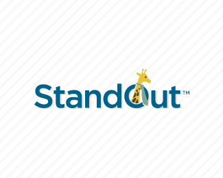
Stand Out
by Siah-Design • Uploaded: Jul. 14 '10

Float
(Floaters:
24 )
Description:
Logo project in progress for an upcoming startup.
Copyright Josiah Jost and Siah Design © 2009
Status:
Client work
Viewed:
6680
Share:


Lets Discuss
Type is really nice, Josiah. Wondering if 'stand' and 'out' should not have the space in the middle...with the 'o' being raised above the other characters it already gives the feel of separation. I think it would be best to have it read 'standout' with just the 'o' raised. Just my two cents.
ReplyAgree with Joe. But really nice font.
ReplyThanks, Joe - yea, the client and I have discussed the issue of having the space a fair bit and my thoughts were the same as your thoughts initially. But client really felt there should be a space as he wanted it clear to be %22stand out%22 and not %22standout%22. I think it works either way.
ReplyOh I bet you could have about 20 different versions of this one with spacing. I like the concept. I agree with Joe though so far.
ReplyI do agree that aesthetically it's better with no spacing. So for now I'll take out the space and re-address the spacing issue with the client. Thx guys.
ReplyVisually speaking, it is more appealing now IMO. Neat idea JJ.
Replygreat type and idea, really like this:)
ReplyI like these, so I floated it, but, considering the brouhaha that went on in another logo's thread, I'm surprised there is no mention here as to how redundant this style of type manipulation is getting to be. Just sayin.
Reply%5EDo you have the link to that thread? I must have missed it.
ReplyThanks Joe and Dotflo.**Trish, it is true that a lot of people have been making typographic concepts for fun lately as they were popular.**But a lot of time, thought and love has been put into this project for an actual company and I'm really trying to push the creativity as far as integrating it throughout the identity(stationery, website, etc). It's not a cheap couple %22shift up-arrow clicks and here's your logo%22 type of deal. I explored several other concepts before finalizing this one.**So in that sense, I think the client is enroute to strong clear and simple brand identity.**
ReplyHey Josiah, just so ya know, I did something very similar: %3Ca href%3D%22http://www.morningcopy.com.au/%22%3EClick Here%3C/a%3E
Reply%5E oh, sh*t, make my logo bigger cream applied there, huh? :)
Reply%5E%5E Was just about to say that %3B)
ReplyLOL! I would have gone much bigger.
ReplyWow Kev, that's a masthead not a logo!
Reply%5E%5E%5E%5E%5EWhy didn't they put up the big one Kev? :P
ReplyWow! I've been wondering who designed that Morning Copy logo for ages %3B)
ReplyBunch of comedians on this site.
ReplySo clever! Perfect!
ReplyThanks, Daria. :)
Replyi've seen the stationery for this, pretty good stuff!
ReplyPlease login/signup to make a comment, registration is easy