WIP
by S.vanElderen • Uploaded: Jul. 13 '10 - Gallerized: Jul. '10

Float
(Floaters:
39 )
Description:
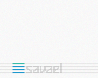
A WIP for a costum interior designer. Monotone is up here to and the colors are based on materials
Status:
Nothing set
Viewed:
9234
Share:


Lets Discuss
Nice :)
ReplyThkx Engar :-)
ReplyNice placement of mark w/type. Not only is it balanced (proprtional, proper) but the arrangement is eye-catching. Good work.
ReplyThanks Jf,*I was pooling for the right place, and i thinking that maybe I'm gonna center the mark and place the name on the same side and Hight
ReplyOh and thanks for all the floats :-)
Replywell deserved floats, nice job..
ReplyI really like the design. If you haven't already tried, I would recommend reducing the amount of lines by 50%25 and increasing the contour weight 2 fold as it may give more stability to the design.
ReplySeeing it in small, perhaps remove the white sections all together.
Replythanks for the advice David :-) (if it's okay to call you by your first name), On this one I allready reduced the amount of lines and I was wondering if more was needed that's why I posted the WIP with comments allowed. Thanks, I will definitely check it.
Reply@Dache*as Helvetic real estate*http://logopond.com/gallery/detail/44535
ReplyPrommised to update, I tried the 50%25 less stipes and here is the result. I'm staying with the old design.**%5Bimg%5Dhttp://farm5.static.flickr.com/4135/4876766578_fda0ff67ae.jpg%5B/img%5D
ReplyPlease login/signup to make a comment, registration is easy