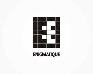
enigmatique
by tass • Uploaded: Jul. 13 '10

Float
(Floaters:
2 )
Description:
work in progress.
any suggestion on how can i improve it?
As seen on:
www.alextass.com
Status:
Just for fun
Viewed:
2859
Tags:
custom
•
custom made
•
branding
•
identity
Share:

Lets Discuss
what is the concept here? I see two e's and the name uses 1.
ReplyThis is pretty neat. @lumo - it's a neg-space E and its shadow.
Reply@tass - Type is not working. It's too tight and too small compared to the mark.
Replyneat.. yess the type is not perfect right now..
Reply@ lumo, epsilon already gave the right answer, there are 2 E letters, one visible and one not%3B %22acting in a manner that suggests an enigma%3B behaving mysteriously or strangely%22 would be parts of the enigmatic definition. *@ epsilon - tight and small? hm about the small part you might be right, not it has the height of a square, or of a line from the symbol. i'll try enlarge it, and maybe that way the tight impression will be solved too*thank you all for the comments.
Replyok thanks for that epsilon. At first I did think it was a spin off of the zip logo from logomotive. I see where you are going now.
ReplySomeone, to whom i have to thank again, pointed early to me a similar logo, %22THIS one%22:http://www.itwswitches.com/images/EE_Logo.jpg %3C--click. **What do you think, how close do you consider them to be? Any suggestions on how can i go further from this similarity?
Replyur very close with d logo on link.. ur one is just looking compressed a bit in reverse colors..just my opinion :)
ReplyGood work Alex!
ReplyPlease login/signup to make a comment, registration is easy