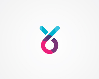
Is it supposed to be entirely legible? It's a great design and looks fantastic, so I think being readable isn't a high priority.**If it was meant to be legible though, that's another story.
Chad I think the whole idea of making logos is communicating with shapes and colors.*This logo is very cool and nicely done but I would never understand what this company sells just by looking at the logo.****
%5E And I bet the first person to see the nike swoosh had no idea it was related to sporting goods. Unless you possess vast mental abilities I do not, everyone learns a logo through its use in context. Just because a design features a house does not mean it is for a real estate agent. **Secondly, I was stating above that this doesn't need to be legible to work, as long as it has some kind of type treatment to fall back on. If it was meant to stand alone, then it's a problem.
Chad it right in the sense that great logos are learned, like nike, but i have to say that the readability aspect is very important...i showed this to some non-designers and they didn't get it. We design for the masses, not for designers...and although it's a nice piece of design, i am questioning it's effectiveness at communicating the message. **Nice, but the readability factor bothers me a lot
I must say that i am one of those who can't read it too. Who likes the shape, likes the colors but can't read it. **I must disagree with you Chad on the NIKE comparison. You said that %22the first person to see the nike swoosh had no idea it was related to sporting goods%22, but in our case not the services relation is the problem but it's readability, the understanding of the mark itself. Of course that you are right saying that if a clear type would be added near it then it will make sense, but on it's own, as you too notice, it's not working. Looks nice but the message sent is very vague and confusing like diego noticed too. **I usually hate thinking on how would a logo look in black and white / one color, but in this case, where the colors suggest a bit the letters differentiation, i think in one color it will make it even more unreadable. **Again, i like the concept, the mark, the coloring style and the colors, the style, but i think it's too abstract for the general audience.
Toss I agree with you.*Also I wanted to add that he NIKE swoosh is an icon (not a word), so the comparison is not very accurate.*Again I want to say that the logo is very attractive and cool.But design is not only made of art, communication is another ingredient.*
When it comes to %22I%22 %26 %22R%22 it seems like pink part is %22i%22 and it continues to %22R (purple part)%22 *IMO - You could have separated the %22I%22 from continuing to %22R%22 by making the whole line (pink %26 purple) an %22I%22 and added another parallel %22I%22 which should belong to %22R%22... *Could hv made the bottom line of the %22E%22 horizontal and attached to the middle line **:) catchy colors... nice work !!!
I think ClimaxDesigns has a point: brands (and thus marks or logos) are meant to stick. **Besides, no mark should ever be shown out of context anyways%3B there will always be a truck, or a letterhead, a piece of clothing or an ad campaign to support the mark.**Think of all those commercials you've seen that have NOTHING to do with the product. When you think about it, those commercials start out funny, sexy or silly just to bring their product or message to you. I believe marks like this draw you in by being %22funny, sexy, silly%22 while still giving the brand some worth (in this case, making the brand feel %22edgy%22).**A logo without a context is like an exclamation point without a sentence before it. This is a beautiful exclamation point.
It is nice as an esoteric mark. It has great flow in the elements, but as a primary logotype, it fails significantly in readability. If this is, in fact the company mark, it needs supporting typography to help it do its primary function - communicate.
%22form doesn't follow function...%22**How so? The purpose of a logo is to be recognizable and memorable, not necessarily legible. This is definitely the former.


Lets Discuss
over all nice but im only getting S, P %26 A..
ReplyThanks dude, I guess I had to compromise a bit.
Replygood colors, but it is unreadable :)
Replythanks buddy, neat showcase :)
ReplyAgree with Bigoods :)
Replyu r compromising more than a bit.. i think
Reply%5E Could still work, with the right application. I think it is great!
ReplyNice looking and hard to read : )
Replypredator!**Looking awesome
Replyyess if at right place it will suit..
ReplyGreat colors, but sorry I can't read it.
ReplyI love this colors.
ReplyI cant read it bud visually I love it!
ReplyI love colorful logos. Reminds me of Trava with that certain look, how you've arranged colors...very nice.
ReplyIt's beautiful, really. I'm sure the lack of legibility can be worked around.
Replyechoing what others said about legibility. Good colors tho.
ReplyIt looks cool but I can't read anything.
Replyso fresh!
Replygreat colors, too hard to read
Reply%5E yeah i definitely agree
ReplyI%60m actually having a prob only with the R. The rest and overall design is brilliant. Love it!
ReplyIf it's not legible, why is it in the gallery?
ReplyIs it supposed to be entirely legible? It's a great design and looks fantastic, so I think being readable isn't a high priority.**If it was meant to be legible though, that's another story.
ReplyChad I think the whole idea of making logos is communicating with shapes and colors.*This logo is very cool and nicely done but I would never understand what this company sells just by looking at the logo.****
Replygood looking but surprised company chose it, cant read.
Reply%5E And I bet the first person to see the nike swoosh had no idea it was related to sporting goods. Unless you possess vast mental abilities I do not, everyone learns a logo through its use in context. Just because a design features a house does not mean it is for a real estate agent. **Secondly, I was stating above that this doesn't need to be legible to work, as long as it has some kind of type treatment to fall back on. If it was meant to stand alone, then it's a problem.
ReplyIt doesnt matter if the text is unreadable. As a mark is great (quite 80%B4s actually)
ReplyThat last comment was meant for taulant.
ReplyBeautiful work
ReplyChad it right in the sense that great logos are learned, like nike, but i have to say that the readability aspect is very important...i showed this to some non-designers and they didn't get it. We design for the masses, not for designers...and although it's a nice piece of design, i am questioning it's effectiveness at communicating the message. **Nice, but the readability factor bothers me a lot
ReplyI must say that i am one of those who can't read it too. Who likes the shape, likes the colors but can't read it. **I must disagree with you Chad on the NIKE comparison. You said that %22the first person to see the nike swoosh had no idea it was related to sporting goods%22, but in our case not the services relation is the problem but it's readability, the understanding of the mark itself. Of course that you are right saying that if a clear type would be added near it then it will make sense, but on it's own, as you too notice, it's not working. Looks nice but the message sent is very vague and confusing like diego noticed too. **I usually hate thinking on how would a logo look in black and white / one color, but in this case, where the colors suggest a bit the letters differentiation, i think in one color it will make it even more unreadable. **Again, i like the concept, the mark, the coloring style and the colors, the style, but i think it's too abstract for the general audience.
ReplySorry for the length of my comment. :)
ReplyI can only read maybe one or two letters, but other than that it's completely illegible IMO.
ReplyToss I agree with you.*Also I wanted to add that he NIKE swoosh is an icon (not a word), so the comparison is not very accurate.*Again I want to say that the logo is very attractive and cool.But design is not only made of art, communication is another ingredient.*
ReplyVery hard to read, but nice!)
ReplyWhen it comes to %22I%22 %26 %22R%22 it seems like pink part is %22i%22 and it continues to %22R (purple part)%22 *IMO - You could have separated the %22I%22 from continuing to %22R%22 by making the whole line (pink %26 purple) an %22I%22 and added another parallel %22I%22 which should belong to %22R%22... *Could hv made the bottom line of the %22E%22 horizontal and attached to the middle line **:) catchy colors... nice work !!!
ReplyI think ClimaxDesigns has a point: brands (and thus marks or logos) are meant to stick. **Besides, no mark should ever be shown out of context anyways%3B there will always be a truck, or a letterhead, a piece of clothing or an ad campaign to support the mark.**Think of all those commercials you've seen that have NOTHING to do with the product. When you think about it, those commercials start out funny, sexy or silly just to bring their product or message to you. I believe marks like this draw you in by being %22funny, sexy, silly%22 while still giving the brand some worth (in this case, making the brand feel %22edgy%22).**A logo without a context is like an exclamation point without a sentence before it. This is a beautiful exclamation point.
ReplyNice colors!
ReplyBuena armon%EDa geom%E9trica y de color, pero dif%EDcil lectura.
ReplyIt is nice as an esoteric mark. It has great flow in the elements, but as a primary logotype, it fails significantly in readability. If this is, in fact the company mark, it needs supporting typography to help it do its primary function - communicate.
ReplyGreat work senangh.*As a side note, i'm particularly impressed with the background.*Works beautifully with the logo.
ReplyAmen Leighton.
Replyform doesn't follow function, but it has a nice form and coloros indeed!
ReplyI still want it on t-shirt!
Reply%22form doesn't follow function...%22**How so? The purpose of a logo is to be recognizable and memorable, not necessarily legible. This is definitely the former.
Replythis does toe the line between flash and substance, but it totally works for me. love it.
Replyin case you didn't get my Predator reference,**http://content.altfonts.com/img/P/R/PredatorA.png
ReplyMy first thought was Predator (vs Alien), too. :)
Reply:)
ReplyI am all for creative inspiration, but this seems a little close, see link...http://space150.com/
ReplyPlease login/signup to make a comment, registration is easy