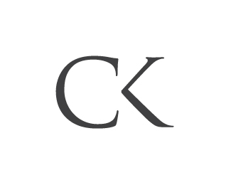
Charmwood Kitchens
by StudioInk • Uploaded: Jul. 06 '10

Float
(Floaters:
13 )
Description:
Studio Ink met the challenge of crafting a brand which recalls a traditional sense of quality, craftsmanship and style for Charmwood Kitchens.
As seen on:
Charmwood Kitchens
Status:
Client work
Viewed:
5302
Share:


Lets Discuss
!http://www.studioink.com.au/linked/charmwoodkitchens-folio-lp.jpg!
Replythis is nice!
ReplyWhile it's definitely nice it reminded me a lot of Roger Oddone's %3E %22Shoestock logo%22:http://www.behance.net/gallery/Corporate-and-brand-identity-Shoestock/249086 %3C
ReplyThe C's are quite.. identical, unfortunately. :(
ReplyVERY nice. Really clean and simple. Love how you've carried it through the identity system.
Reply@Art Machine and Lecart: Now that is a shame. :(*@sdijock: Thanks!
ReplyI agree with the above comments..... Great structure and clever use of typography! It's also good to see that the 'CK' will stand on it own, but still be indentifiable as the brand. Very nice work indeed.
ReplyThanks Dan!
ReplyPlease login/signup to make a comment, registration is easy