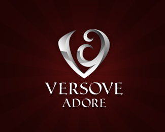
Versove Adore V06
by sbj • Uploaded: Jul. 04 '10

Description:
Updated one..
for a new eye wear brand.. they want somthing elegent wid classic look with initials V & A.. any suggestions to improve..
old one is here http://logopond.com/gallery/detail/108699
Status:
Unused proposal
Viewed:
2747
Share:


Lets Discuss
realy love this logo sbj
ReplyThanks Deividas for comment n appreciation %26 also for breaking the silence..
ReplyCaught my attention right away. Beautiful peace. This typo matches better than the previous one :).
ReplyThis is a really nice idea you have going on. I instantly see adore in symbol and the V and a. I'm loving it, but wonder if it could be perfected. It's well worth trying IMO. I think the a is falling back too much, maybe roll the curls %3C that way to help balance it out better. REALLY cool so far though.
ReplyThe shadows might be conflicting and causing some of the off balance appearance??
Replythanks myob n Mike .. yess agree wid u to make it more perfect n balanced.. shadows origins r different %26 done intentionally, i think due to them it looks lke this in its present avtaar.. becoz with correct physics its not looking good.. but if u feel it has potential with correct shadows.. i will sure work on it :)
Replysbj, I hope you don't mind my suggestion and link, but I did this http://logopond.com/gallery/detail/81524 . I took the JB into photoshop and selected just the solid white area (JB) and used/applied the bevel tool to see the right shadows and angles.I then redid it in vector. To me it looks like your doing something similar here because I see some slight beveled on convex angles? Hope that helps, if not looks good anyhow. :)
Replyi really mean ur suggestions n comment they worth lot to me.. i try this time ur way.. thanks thanks a lot for making me to do right :)
ReplyWith logomotive on this one%3B just try rotating the %22a%22 a few degrees to the left. May make it a bit easier to see (but will close the space between the two arms of the V, so it's a trade-off). Still, it is very pretty and I doubt the consumers will fuss as much as we do about the position of the %22a%22 :)
Replythanks limeshot.. yeah mike has a valid point %26 m working on it.. i think the A issue is also sum how valid but if i do more then it starts hurting over all look %26 feel..*thanks
ReplyPlease login/signup to make a comment, registration is easy