Passenger Productions alt
by Oxide • Uploaded: Jul. 02 '10 - Gallerized: Jul. '10

Float
(Floaters:
115 )
Description:
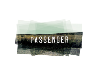
Passenger is a creative company that employs various media to deliver well-crafted stories for business, advocacy and entertainment. To read about our thinking behind this logo, visit our news.oxidedesign.com
As seen on:
http://news.oxidedesign.com/passenger-productions-
Status:
Unused proposal
Viewed:
23806
Share:


Lets Discuss
That's really nice looking...
Replysweet idea and very well executed!
ReplyI really like this one, great concept and matching execution.
ReplyHm...
ReplyLove this one.
ReplyHm indeed...
ReplyI love this!
Replylike.
ReplyVery original!
ReplyOk, but does it work in black %26 white?
Replygreat! *@nrcreative: I think that this is not a problem :)
ReplyInteresting, like it.
Reply@bigoodis - If it doesn't work in B%26W and is not applicable across all types of media. . . then it doesn't work.
Reply@nrcreative: use of the logo in black and white palette is reduced to a narrow range of subjects, almost all now we can do so. If it can not be imposed on the pen or something like that, then there are solutions, but now printing technology is very advanced. So I think these questions (about the use of black and white) is not quite correct.
Reply@Natham, maybe you don't know Oxide but they'll make it work in any media... and black and white, Great concept, just enjoy it!! and do some research.
ReplyLove it... how refreshingly original!!!
ReplyVery nice! Love it.
Replylol@nrcreative**Oxide - you do some great work
ReplyI like how unconventional this is. This is what makes designers stand out. Kudos.**nrcreative: Times are changing. I also believed a successful logo needed to be 1 to 3 colors and had to work in black and white.. But I think it's less and less important nowadays due to production methods. **Black and white went the way of the dodo %3BP
Reply@Rudy and raja - I know he does great work. Extremely impressive showcase.*But be honest - if this was in B%26W do you think it would be in the gallery? I don't.*I guess I'm stuck thinking that a good mark is one that works with only 1 color.
ReplyI used to take b%26w pics of sunsets all the time. this would look great in grayscale or b%26w in my opinion. some people just don't have enough imagination to see certain, out of the box designs in b%26w. even at small scale, you could make those windows solid white and gist of the logo would still come thru.
Reply@AnthonyLane With you on this one%3B these days some logos don't ever get printed on anything but perhaps invoices (and even those are sometimes sent by email). Plus, logo design needs some space to evolve, and printing technology innovations create that space.
ReplyIt looks great, I dont think anyone disagrees with that. I cant see it scaling at all or looking as good in black and white however.%0D*%0D*Thats the beauty of opinions.%0D*%0D*
Replyclever :-)
ReplyI like the idea, but I can't imagine this being usable enough in real life. I don't see how this would work on a DVD spine, a photocopied screenplay or in small scale on a poster in b/w or monochrome. The type is too dark and too small.
ReplyBeautiful emotion captured in 3 frames...This would make for a crazy opening credits reel!
ReplyThis is so cool! Superb execution too. @barryconvex : Take a look at 20th Century Fox's current logo in all it's 3D glory. If they can get that to work on a DVD spine, I doubt there would be any problems with this one.
ReplyFox's logo is much more square and they use their name as the most prominent element of their logo.
ReplyBarry, it may not be the most iconic of all logos and sure it works much nicer here in color than it probably would in Black and white. But I can def. see this working for the company, A little imagination...
ReplyIt takes a good graphic designer to be able to think outside of the box. I can come up with a number of ways how this could be applied to a DVD spine. Guess they'll hire me first.
Replybarry, here is a logo from your showcase, **http://logopond.com/gallery/detail/99135**I don't like to do this but with your heavy handed authority on logo design I thought it was fair to share**Anyway, Oxide, I think this logo will get very popular this year, again, great work!*
ReplyThank you for mentioning my logo. Yes, it's a cool concept, isn't it? With my %22heavy handed authority%22, I appropriately mentioned (like a couple of others), that and more importantly why this logo will most likely not work in day to day use although the concept is fine. %0D*But I'm used this kind of nerd communication http://logopond.com/gallery/detail/71629%0D*If you don't join the chorus of praises and instead write something politely that actually might help to improve something it's the same crap: If you don't like details it can only mean that you don't have a clue about design and never will. Yes, Halleluja, I know which members to avoid in the future.%0D*
ReplyBarry why try to go off on a tangent here? Just take the medicine and move on.
ReplyI don't see why this causes such a fuss. I know what a DVD spine looks like. And if you read a comment like %0D*%0D*%22It takes a good graphic designer to be able to think outside of the box. I can come up with a number of ways how this could be applied to a DVD spine. Guess they'll hire me first.%22%0D*What do you conclude? That you simply apply the logo as is? %0D*
ReplySo you think you can sing?
ReplyWhat a lame comment. So you think you can see this working %22with a little imagination%22 is a more valuable help than what I and others have correctly pointed out?%0D*But how dare I forget, it's not what is said, it's who says it.
ReplyBarry, the designers commenting in favor of this piece have been doing their job for a very long time. By the looks of your gallery, you could probably learn a bit from what they are trying to tell you. (No offense) Like Mike said, there's no use continuing to beat a dead horse. In this instance- you are incorrect. It COULD work.
ReplyLol @barryconvex, gave me a good chuckle.
Reply%5E Yep.**I'm holding a DVD cover as we speak. It is 4 colour process with a spot fluro %26 varnish...a design such as above would be effortlessly reproduced on this.
ReplyGlad I decided to stop complaining about this one a few days ago. . . %3B)
Reply%22What do you conclude? That you simply apply the logo as is?%22 No, I said I could come up with a number of ways to apply it.
ReplyAmazing this much heated debate over a concept. It's not even the chosen mark. I guess that doesn't matter, still crazy though.
ReplyI like this concept and can see how it could work across different mediums, but I think the chosen concept by the client is much much better, it is much more inspiring to me.**I think someone should take all the comments ever posted on the pond and make a book out of it. It would make for a humorous read. I would definitely buy it.
ReplyDon't get too flattered. %3B) It is an age old debate.
Replyamazing logo. it has great feel to it
ReplyReally atmospheric. Love it.
ReplyThanks for all of the comments! We really enjoyed reading them.**This was actually the original direction the client wanted to go. We built out the logo in various forms including the color logo on a white background and an all black and white version. We'll reserve the right to show it only in it's ideal form here, so we'll let you use your imaginations on how it would look.
ReplyAwesome. I love the way the window on the left kinda fades out.
ReplyI love how much controversy and debate this logo has stirred up.. I wish there were more conversations like this on logopond..**You did good, Oxide!
ReplyMmmm, Is it a logo? But then, what is a logo?.. so why not!... It's very visually satisfying to look at.*
ReplySomeone should publish a book titled, %22Is it a Logo? We don't Care! It's Pretty!%22. Really.
ReplyFor those who question if this is or is not a logo, please keep in mind that it was created for a film company with the intention to animate the final logo. **Think of it as the logo displayed during the opening credits of their films. Studios like DreamWorks, Paramount, TriStar, and 20th Century Fox for years have all had versions of their logos that are not suitable for black and white printing.
Replyit's really fresh and cool..*I love it
ReplyOxide - love the thinking, love the mark.**I get annoyed with people saying things won't work. Many colorful logos have an alternate version for B%26W usage.
ReplyCool and creative as well, but... remember there are 3 elemental principles about Logo Design: *1. Simple*2. Memorable*3. Versatil (Ups, it fails right here)
Replyand*%234 Reaction.
ReplyTotally agree Nathan. I can see this in black %26 white and sized down to fit on a golf ball as well. Some people can go into a decorated room and still see the bare bones of it, others can only see the decoration. I guess a lot of people fall into the second category here. Can't see the logo usage for the logo. Too many mixed metaphors!
ReplyI get where nrcreative is coming from, but I floated it anyway. I think that, in the right application (especially with animation) it could be great.
Reply@laye - As the newest member of the Oxide team (only three years out of school) I once held on to these principals as well. However, what I soon came to understand is that it isn't 1965 anymore. Printing costs have gone down. Also, this isn't a non-profit that won't be able to afford 4-color printing. As a film studio, their logo will appear in digital form 95%25 of the time. When unavoidable, we believe the sunset could still be memorable in black and white - see Ansel Adams.
Reply%5Ewell said :)
ReplyLove the concept and execution! Congrats!
ReplyIf this logo is only for showing it on screen, than it is a wonderful one.
Reply@oxide, very cool. would also make a good cover graphic for a movie and/or book entitled 'passenger'. and if needing be horror, just toss some blood splatters on the third window and color the text red %3B).**Taking into consideration the context of how a logo will be used is just as important, if not probably more important these days, than simply adhering to age-old logo 'rules'.
ReplyTheatrical, and impressive
ReplyNow this is a cool logo
ReplyWow, I feel like I'm in that train. Awesome.
Reply%5EExactly. I'm sure that was Oxides intentions
ReplyI like how it has a happy ending in the final frame
Replythis is the best design i have ever seen. check out my logo and comment please. search for tentcamper
ReplyI'm not even a pro, and I can see how this is a great logo that could work anywhere AND in B%26W.*excellent work oxide!
Replylove it!....excellent work!
ReplyVery interesting concept!
ReplyYES!
Reply))*http://www.nat-geo.ru/contest/1/bystrov/474/
Reply100! thanks to barryconvex for making this happen!
ReplySaw the other version of this and had to make sure this one was seen once again. I've always loved this one. And I like to help out with anything from my home state of South Dakota as well. :)
ReplyPlease login/signup to make a comment, registration is easy