StAr I.D.
by Jeiji • Uploaded: Jun. 25 '10
Description:
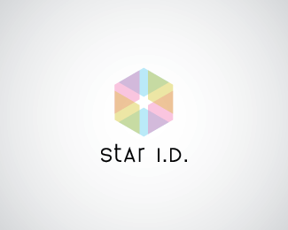
STacy ARistilde is an interior designer looking for a new identity. She's pretty set on this and another one for her services. See the cube? Space. See the star? StAr. Yee.
Status:
Nothing set
Viewed:
4185
Share:



Lets Discuss
dig the mark...type looks very uncomfortable...:)
ReplyThanks! Any suggestions?
ReplyI agree with what nitish.b said.**I also like the mark but it's a bit too transparent for my taste - type stands out, mark fades to the background.**Maybe make them both transparent or try making the mark more vivid?
ReplyThanks, Myob! But what about font suggestions? I still have problems with that.
Replyhey...look at david's folio*http://www.helveticbrands.ch/portfolio/branding/*
ReplyThe letter that stands out the most is the %22t%22 letter.**As I understand, the %22S%22 and %22A%22 are both high capitals, while %22r%22 is a low capital, so I think you wanted %22t%22 to be a low one also to ballance that out?**%22t%22's ascender is too much above the cap line making it look inconsistent in my opinion. Lowering the whole upper half of %22t%22 to the level of %22S%22's top should make it look better already :).
ReplySorry for the double post, again I've noticed nitish.b's reply too late :).**Words can't describe it as good as an image can and Helvetic's portfolio should definitely help you come up with some adjustments :).
Reply@ Nitish: thanks! He's got some good combos.
ReplyPlease login/signup to make a comment, registration is easy