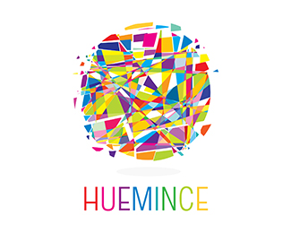
HUEMINCE
by 51X • Uploaded: Jun. 24 '10

Float
(Floaters:
3 )
Description:
The mark consist of a sphere of many hues, minced into pieces. The name is also a play on the word "Humans"
100% Custom type
Status:
Work in progress
Viewed:
6766
Share:

Lets Discuss
Revised version. Better?
ReplyI like the idea that you're playing on 'humans'.....but for a somewhat organic/abstract/modernist logomark, the type is lacking. It's too thin, has no 'humanity' to it. Looks like you stripped off all the humanity of those letters and just left the bones, in a manner of speaking. **Needs to be more organic, soft, full, curved, flesh-like, soulful. Human qualities to convey your concept. That's the beauty of logo design -- communication without words, even when words are used in the design.**Make your letters, your typeface...make it all more human. That's what I think.
Reply%5E very well put
ReplyJF, I thank you very much for your input and I value it very much, but as valid as your point is I wish you could see the story conveyed in the logo and type as it is right now.**This idea displays %22Humans%22 as what they have become- colorless, soulless, and square (void of all the qualities you mentioned)- represented in the type. This leads to all that is %22human,%22 abstractly represented as our planet(full of color and life) in the mark above, being broken, minced, chopped and destroyed. It is a much darker, but much truer story. You can argue on whether it's the right story to tell, but that's something else.**Either way I thank you for your input, and you have been very helpful in providing an alternative.
ReplyPlease login/signup to make a comment, registration is easy