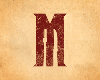
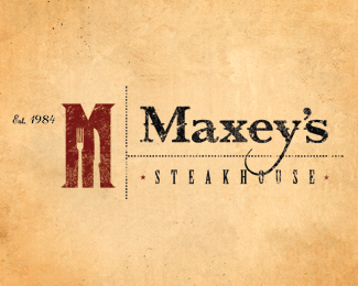
Maxey's Steakhouse M Logo 2
by colliervinson • Uploaded: Jun. 03 '10

Float
(Floaters:
25 )
Description:
Maxey's Steakhouse
Wheeler, Texas
Logo Alt 3
Status:
Client work
Viewed:
12678
Share:


Lets Discuss
i like the feel, but i think if you could somehow remove the fork and just include the steak knife it would be stronger. I think the steak knife is a great visual link, but the fork just presses the visual further than it needs to go.**just my 2c
ReplyReally nice! i like the fork and think the knife would seem a little lonley without it.**damn now i got really hungry.
ReplyI completely disagree with cobaltcow's comment about the fork. Great logo.
ReplyI eat my steak with a knife and a fork.
ReplyThis is really nit-picking here, but as a person who's worked part-time in hospitality for 8 years I will say that the blade of the knife faces left towards the napkin. See what it looks like with the knife reflected.**Otherwise, I really like this!
ReplyI like it too! I like kleetz comment about flipping the knife.
ReplyI love the nice tall %22M%22. It reminds me of the shape of a nice New York Strip stake.
ReplyThanks for all the input everyone. It's encouraging to know it caught your attention enough for each of you to take the time to comment.
ReplyWhen you order a big juicy steak they give you a special knife, i think that is what cobaltcow commented. The knife should be a steak one, bigger Texas size...
ReplyGreat style.
ReplyGreat logo design collier :) I like it**Carried in Cruzine: http://www.cruzine.com/2010/09/17/restaurant-logos/
ReplyPlease login/signup to make a comment, registration is easy