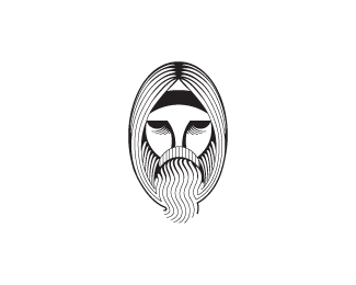
Dia de Muertos Party
by chrisrojo • Uploaded: May. 30 '10 - Gallerized: May. '10

Float
(Floaters:
94 )
Description:
Logo for a mexican dia de muertos party.
As seen on:
http://www.behance.net/chrisantolin
Status:
Nothing set
Viewed:
17904
Share:


Lets Discuss
what is this for? i like it mate
Replygreat work!
Replycool stuff..
ReplyThis is insane. Excellent work!
ReplyGreat typo.
Reply%5E type not typo :)
Reply%5EHehe.
ReplyI don't think I have seen this particular style on here before. Good job, Chris.
Replydefinite new style for the pond...congrats
Replyhot stuff Chris!
ReplyThe line work looks great. Good job!
ReplyHey Thanks!
Replyi love the type and the overall appearance. great work!
Replythe style fits the theme wonderfully, hay talento, hay talento %3B)
Replyawesome and fresh work, Chris. me likes.
ReplyI like this Chris.
Replycongrats...great stuff
ReplyGood job, Chris.
ReplyVery original. Awesome work Chris.
ReplyGreat design.
ReplyWhat the world needs.
ReplyHey dude, I did a similar thing like showing the design process on my site: www.clarmont.ca under the %22design methodology%22 page. Let me know what you think of it. I really liked the way you did yours.
ReplyAWESOME*
Replyhave you any link for tutorial for this kind colouring ( like pencil line ).. btw nice work
ReplySorry Ricky, no tutorial, you just need a wacom tablet.
ReplyHey Paul, the way you present your work is better than mine, I really liked!
ReplyIt's hard to see anything at your black behance folio :D
Replyhaha, i think your right Milou i'll work on it, thanks man!
ReplyReally nice work
ReplyNice one, man. I'm really digging this. It feels very rooted in Latino culture. You did your homework!
Replyawesome work!
ReplyPlease login/signup to make a comment, registration is easy