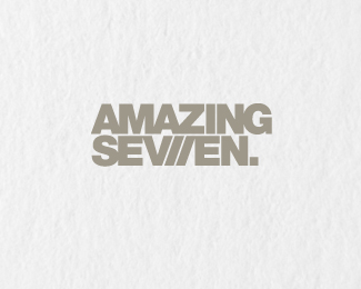
Amazing Seven /logo on white
by Loogo • Uploaded: May. 24 '10 - Gallerized: May. '10
Description:
A new fashion store in Stockholm. For more information go to loogo.se
Status:
Client work
Viewed:
19653
Share:

Lets Discuss
love this, great job!
ReplyGreat! Do you really need the dot?
ReplyThanks, I was a bit unsure of the dot, but chose to keep it on the grounds that it disturbs the eye a bit, which I thought was more interesting.
Replyloving this concept!
Replykeep revisiting this one...just added to the favs pile!
Replyi love it a lot. i think the dot adds to it. GREAT WORK!
Replynice %26 clean like it..
ReplyLooks great to me, good job!
Replygood ol' helvetica and a brilliant idea. good stuff over here :)
ReplyThanks, your words make me happy. :)
Replyterrific work. nice approach. :)
ReplyI'm a fan. Very memorable.
ReplyHi tommy,%0D*%0D*We are interested on you will design a logo for us, please contact us:%0D*[email protected]%0D*%0D*Nice logo!%3D)
Replyreally liking this clever logo! *snyggt! grattis! :)
ReplyThanks again!**@ ENRIQUE - I have sent an email to you now, thank you for your inquiry.**@ Henric - Tack! :)
ReplyVery strong! I like it a lot! congrats!
ReplyThis is very nice. Disappointingly for me, it took me a couple days of seeing it to get the roman numeral reference.**It's been a long week.
ReplyLove this, however when I first saw it, I thought the 'z' in amazing could have been some how incorporated to create the %227%22. None the less a good job done.
Replyvery impact!!
Replywow
ReplyVery, very, very nice! Love how you've included the Roman %22VII%22 in the logo!
ReplyThanks again!
ReplyAs soon as I see this design, I associated it with designer fashion. Excellent work friend!:D
ReplyPlease login/signup to make a comment, registration is easy