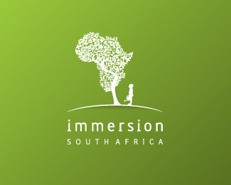
Immersion South Africa
by greglomas • Uploaded: May. 20 '10

Float
(Floaters:
39 )
Description:
Immersion South Africa are a company who help bring volunteers to South Africa from overseas to volunteer in community projects in rural environments
As seen on:
greg lomas's
Status:
Client work
Viewed:
6116
Share:


Lets Discuss
great stuff
Replythat mark is something to behold!
Replygreat mark. detail is quite small but it hold up at this size.
Replygood its real
ReplyVery original. Nice work.
Replygreat shapes and detail on the child.
ReplyNice one!
Replyperfect! love it!
ReplyGreat!
ReplyVery nice work. Love it.
Replyvery strong! great emotional direction.
Replyi love it. this is so unique!
ReplyThat is a nice logo but not completely original.*http://logopond.com/gallery/detail/59494
Reply%5E %5E Ah, had a feeling I'd seen this concept before.
ReplyDate Submitted: May. 20 '10*Added to Gallery: May. 20 '10**woo... that's fast . . . i like the concept**and i think that if Ocularink thinks he'd see it maybe is in DANONE logo that's the mark i remember with a boy looking to something above... and it's a star and is just the head of the boy.... just... saying... i love this logo...
Replydifferent messages, but same general concepts. The two have two entirely different messages and executions and feelings, but I always wonder about inspiration and how it was achieved.
Replylove to see new and differents concepts, congrat.. well deserved
ReplyWell I added this one and I can honestly say it will be my last add. I have seen far less worthy stuff in the gallery,.Waht is the purpose here?
ReplyWHAT is the purpose when chosen designers are asked to help in gallery, yet being controlled by ones choice?
ReplyHowever, I totally agree about the spacing of South Africa, if that settles the fuss.
ReplyThe African Playground is an uncanny example, and makes me feel peculiar.**Would changing the spacing help?
ReplyThis logo was raising the standard of the gallery and this site a lot, in my opinion. Keep up the great stuff, Greg.
ReplyGreat work.**
ReplyVery nice concept. %0D*I guess I'm not the only one who's curious to know who's adding logos to the gallery (and why, if there is a guideline.)
ReplyThe mark itself seems worthy enough to be in the gallery. One nit-picky thing about the typography, to me, shouldn't grant a removal. Perhaps just express what might improve the logo and see if the designer responds.
ReplyI absolutely love this concept! The only thing that bothers me with this logo is that the whole of Africa is depicted in the graphic, when %22South Africa%22 is actually a separate country. I feel that this doesn't represent the wording correctly.**..still love the Africa Tree though! :)
ReplyPlease login/signup to make a comment, registration is easy