SkyCube
by Raja • Uploaded: May. 10 '07 - Gallerized: May. '07

Float
(Floaters:
56 )
Description:
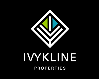
Proposed identity for a new aerial property surveyor
Status:
Nothing set
Viewed:
15041
Share:


Lets Discuss
wow!
ReplyAs usual, great work :)**At first, I thought 'why so literal the plane', but it seems to fit into the whole image well. Very nice.
ReplyMaybe you should invert the blue and green colours on the cube to resemble earth (blue for sky, green for land) ...right now it looks like a plane flying over water with a green sky! :)
Replyreal nice dude :) weird if you write a comment and then rate the comment doesnt record ... but magic
ReplyI will have to agree with bpotstra on the color swap. Otherwise, neat idea.
ReplySkyHexagon?
ReplyThanks guys. The image is an aerial view of a plane flying over water and land. The sky would be above the plane.**dache, no. Skycube.
Replyraja said: Thanks guys. The image is an aerial view of a plane flying over water and land. The sky would be above the plane.***Even so, visually it would look better with green on bottom and it would still make sense. Also, with such a large mark and the bottom of the mark being blue, the type gets lost. Change it up, and the business name will feel a little more important. Haha, sky hexagon. There goes Dache trying to cause trouble. :-P
Replyballe balle... actually i think its nice the way it is. just one question though, any reason why the right handside of the green isnt darkened?
Reply%5E%5E%5E%5E%5E Same question I was gonna ask.
ReplyI think it is spot on the way it is. The shading gives the mark more depth. Leave it alone Raja. Nice.
Replygood type, very nice combination and use of colors!
Replynice nice
ReplyVery Nice!
ReplyI like your thinking here, Raja.
Replytx guys!
ReplyI really like it. Great concept raja! **Although, I'm afraid I agree with everyone else... the colours should be swapped. This won't effect your rationale of sea/land and will make more sense to joe blo on the streets if they see it as land/sky.**One other thing I did notice, and it's probably just an optical illusion, but, at the bottom tip of the right wing, the blue blue edge seems to be slightly longer than that of the green edge. It's either that, or my eyes are crashing and burning on me.
Replyyou are right koodoz - its off by one pixel - something my other monitor did not pick up - but i see it now on this shiney new 24 inch iMac!
Reply24 inch iMac....drool....I was looking at one yesterday....nice mark Raja.
ReplyI actually picked that up on my 15%22 powerbook. My eyes are not so bad after all :)
Replylove it. brilliant!!!
Replyi like it, its clean.
ReplyRaja, I think the niggle is the perspective, after reading everyone's comments... Have you drawn this as if from above? - bet this works fine on a sheet of paper lieing flat on a table? Here however the cube is seen on an upright screen, hence the comments to put the blue sky above the green land. Good design always makes sense.
ReplyA very neat concept.
ReplyThanks guys!**Ez - good point you made there. Yes, it was an arial view.
Replyirado!! amazing!
ReplyLove the Mark - very creative!
Replyjust cool
ReplyAlmost three years old and it still makes me look like an amateur. Such a classic.
Replythank you all**chad, a lot older than 3 years, that's just the date posted. You are not an amateur %3B)
ReplyPlease login/signup to make a comment, registration is easy