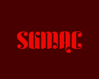
SUMAC
by michaelspitz • Uploaded: May. 02 '10 - Gallerized: Jun. '10

Float
(Floaters:
47 )
Description:
Typeface in development (WIP)
As seen on:
SUMAC via FLICKR
Status:
Work in progress
Viewed:
15,361
Share:


Lets Discuss
interesting type Michael. what is it for?
ReplyS Not quite fitting here IMO and C (look at lower left part of C) and needs to be adjusted to height and baseline.
Reply@andreiu - Thanks! Nothing in particular, just something I%3Bve been playing with for a couple days. I've actually made a pretty good dent in it, but I've got a few guys %5E(the 'S' etc.) that are giving me a little trouble...**@logomotive - That darn 'S' has been giving me loads of trouble (looks totally skewed I know) %3B) Maybe I should square it off like the 'C'..?
ReplyI think more square would help the S and give it more weigth to match the other characters.
ReplyI'll wait for the update. and about that nasty %22S%22, I would go with something more squared as Mike said (it should look somehow like a %225%22 IMO)
Reply@andreiu- Ha! Indeed. I actually three up an update after my last comment in case you missed it? Not really a %225%22 per say...more of a reversed %22Z%22 but it's definitely a bit squarer.
Reply%5ESorry %3E 'threw up an update' %3B)
ReplyNice style, bud.
ReplyThis is pleasant. Maybe just the mentioned already 's' is a little outta here, but it's got good looking.
Reply@Ocularink - Cheers my man!
Reply@milou - Thanks buddy! Yeah, that 'S' is still in need of some cohesion work... Right now I've got about 60%25 of the characters drawn out (upper %26 lower) but a few of these guys are proving to be a tricky fit...
ReplyS is always a pain in the a...ss... Keep it up bud!
Reply@milou - HA! No doubt... Thanks! %3B)
ReplyLooks sweet so far MS, can't wait to see more.
Reply@JoePrince - Thanks a bunch my good man! Definitely more to come!
Replysent you an email Mike.
Reply@logomotive - Thanks again Mike!
Reply@ClimaxDesigns - Of course, however the type is generally constructed asymmetrically top %26 bottom throughout the typeface...*(EX: If you look at the (left vertical upright on the %22U%22 %3E you'll see the curves are actually the same as the %22C%22...)**I basically started out with a set of format guidelines %26 I've simply been following through with them. I'm nearing about 60%25 completion at the moment...no punctuation etc. but the upper %26 lower cases are moving along.**Again, that particular point could obviously be tweaked if the balance feels impacted. Still, I'd probably want people to have a look at the full set before the minor style re-format tweaks get made... Perhaps the asymmetry makes more sense next to the larger set?
Reply@ClimaxDesigns - Thanks David. I'll be sure to post a link as soon as I get a chance to pull a good spread together. Cheers!
Reply**UPDATE***Posting a link to an initial run at the full type set (minus %23's / punctuation, etc.)**Still a bunch of tweaking to do, and a number of characters to rework (D,S,Y,Z...to name a few...) But we're getting there %3B)**%3Ca href%3D%22http://www.flickr.com/photos/michael-spitz/4574016090/%22%3E**LINK**%3C/a%3E
ReplyVery impressed with the entire set. Would love to use it some day. How many hours do you have in this so far?
Replylooks much better now! and I'd ask what Kevin already asked.
Reply@Ocularink - Cheers Kevin! Thanks so much! And most definitely %3E just as soon as I manage to knock it out...**All told, I'd say about I've got about 16-17hrs in it so far... Definitely ran into a few tricky spots along the way that slowed me down. I probably invested a good 7 hours in it yesterday %3E albeit some of them in the 'wee' hours of the night...so perhaps not my most productive... %3B)**So happy to be getting such a positive response! I've had a few type projects in the works for a while... So far this guy has gotten the furthest along.
Reply@andreiu - Ha! Sorry %5Ethat message took a min to write... I hope your question was adressed? %3B)**Thanks a bunch!
ReplyKudos Michael!*Keep up the good work:)
Reply@Rokac - Cheers buddy! Thanks a lot! :)
Reply@Type08 - Thanks a bunch Alen!
Replylooks great! the U looks a bit like a K to me tho.. and the C could use some roundness, more like the S..*does this has anything to do with the delicious spice sumac? :)
Reply@bilebo - Thank very much Henric! Obviously if you view the full set, most of the characters tend to make sense in context %3E but it's certainly necessary for them to be able to stand on their own. This typeface has proven to be a bit a tricky build due to the design language I've working with...but I'm still tweaking things as I go along...**As far as the spice reference %3E it certainly does %3B) There's definitely an organic feel that I tried to work in, along with the primary color inspiration for the specimen draw from the fruit of the plant. The tasty spice vs. the often poisons character of the plant family has always been intriguing for me, and the name seemed like a good fit for the style.
ReplyMmmm..... Lovely work, Michael. I've actually been working on something similar for ages. Any chance to get a sneak of the full alphabet?
Reply@mabu - Cheers! Thanks a lot! :)**I have no idea why the link at the top isn't working..?**In any case, you can defentily have a look at the full set here %3E %3Ca href%3D%22http://www.flickr.com/photos/michael-spitz/4574016090/%22%3EHERE%3C/a%3E
ReplyI very like your logos, and this work is not exception *:-)*Very good... as allways.
Reply@Petro - Thanks a lot Peter! Greatly appreciated! :)
ReplyGood to see this in the gallery, I really like this font, Michael.
Reply@ethereal - Cheers Sean! Thanks a lot my man!%3Cbr%3EJust saw this hit the gallery... Definitely appreciate the post! :)
Reply@radhacelis - Thanks so much! :)*For the 'x' I kind of know what you mean %26 what I may just do is flip it inside out mirroring the 'U'. In context, everything seems to mesh together pretty well, but as far as standalone characters, I'll admit there might be a bit of learning curve here and there. Still working on it so there's certainly room for improvement. Glad you like the 'Y' %3E one of my personal favorites as well %3B) Cheers!
ReplyI just went through the alphabet. Kudos dude.
Reply@onetreeink - Thanks a bunch Marcos!**@mabu - Cheers Mads! Thanks again!
Replyvery cool, mr. Michael.
Reply@Mikeymike - Thanks very much indeed Mr. Mike! :)
ReplySo damn good...
Reply@thomas - Cheers! Thanks a lot!
ReplyI like this type more and more each day Michael...hot stuff man.
Reply@JoePrince - Thanks again buddy! You know I appreciate it!%3Cbr%3EGotta get moving and finish this guy... %3B)
Replyvery good typo, eyecatcher.
Reply@invitroagency - Thanks very much!
Replynice
Reply@suPerKiTtY - Thanks a lot!
ReplyAs almost everyone said, it's a great font concept. Strange and curvy, but really interesting!**Can't wait to see the whole charachter set with the %22S%22 fixed and balanced.**Keep up the great work!
Reply@Unique Design - Thanks a lot!
ReplyThis was very nicely done!
Reply@Noetic Brands - Cheers! Thanks so much!**Seems like this guys is taking a while to nail down in it's entirety... Work. Always getting in the way... %3B) I've been considering releasing just the primary alphabet to get things rolling, but I'm also kind of determined to flesh out the whole thing before the debut... See how I feel when I finally settle on an '%26' %3B)
Replythought i'd commented on this... at least of admired it long enough... good stuff Mike...
Reply@nido - Thanks a lot my man! Much appreciated! :)
Replygreat piece of typography work, I love it!!
Reply@AlexWende - Thanks a lot Alex! :)
ReplyOnly just saw this recently (better late than never though!) and been looking through the Flickr set - awesome stuff. I particularly like the A, K, M, f and t.. although I could go on. Hope it's coming along well and good luck with metrics etc. (the best part..!)
Reply@clairec - Thanks so much Claire! It's coming along, albeit slowly... Don't even get me started on metrics! %3B) Luckily a chunk of it is kind of fixed width, so that helps. But the rest, oh my...
ReplyPlease login/signup to make a comment, registration is easy