StringTravel
by Rokac • Uploaded: Apr. 28 '10

Float
(Floaters:
19 )
Description:
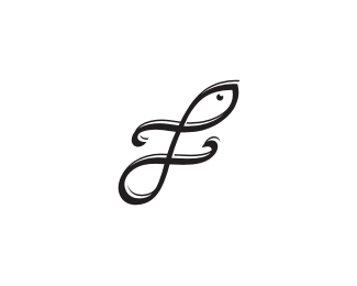
The whole concept was build around logarithmic spiral (string) that represents balance, regeneration and growth(nature). The bottom part of the symbol represents earth and the upper one sky(sun). Number of sun rays is intentionally three because the main audience of the company will be people from Alps - Adria- Danube region of Europe.
I was concentrating to develop as basic mark as it gets, precisely because of the wide range of audience. Also you can see the letter "s".
Type is custom.
Your thoughts guys?
As seen on:
stringtravel.com
Status:
Client work
Viewed:
4576
Share:


Lets Discuss
Well done, Roko.
ReplyThank you Milosz!
ReplyAccepted by the client. Drinks are on me:)
ReplyGreat work. Congrats
ReplyCheers donadelli!
Replyit's cool. :)
ReplyNo, no, you're cool Pierro:) Thanks buddy!
ReplyPlease login/signup to make a comment, registration is easy