Madison Downs College Preparatory Academy
by kaimere • Uploaded: Apr. 19 '10
Description:
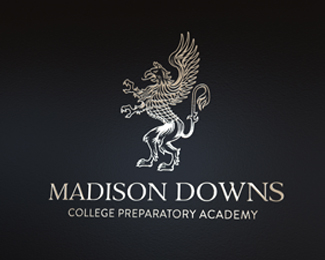
Madison Downs College Preparatory Academy Vector line logo/mascot...
Crest is still in development
kaimere n Mr Ricketts
As seen on:
Status:
Client work
Viewed:
6229
Share:



Lets Discuss
awesome man, so intricate :)
ReplyNice work Mick :)
Replycheers Garr
ReplyThanks Euan :)
ReplyThe upper and lower part of the figure don't match IMO. It looks like glued from 2 different shapes and styles which can also be noticed in the strange perspective. What is that huge chunk of solid white in the lower region? And the wing seems a bit weak for the creature of this size. I think it still needs a lot of work, these babies are hard to make, I know that, but I also know that Master Kaimere can do it much better.
Reply%5E agree with Alen.
ReplyCheers for your opinions ... unfortunately i dont really agree... **I can understand you thinking its glued together when a griffin is ... well ... two different animals an animal and a lion ... being an imaginary animal well ... i thought the wing size albeit a stylistic choice was proportionate for the applications that ill use over the various collateral for MDCPA. **Cheers for the opinions but i think the %22odd%22 perspective may be throwing you off so ill update when i have time... as the foil maybe clouding your perception, too much light reflecting.
ReplyYeah, must have been the lights........ The collateral format shouldn't stop you of making wings look more powerful, it just might add to the overall strength of the mark, something like this http://www.eaudrey.com/myth/images/Griffin.gif
ReplyFor every griffin you show me with big wings doesnt make it right in my eyes.... its for a preparatory school so it doesnt need to be as threatening as an american football team logo. **Power for a school indicates what ..... ?**You have to realise that as designers we take our own spin what i have adhered to is the crest heritage nothing more nothing less ..... bigger wings will in opinion dominant and create this powerful beast which is not the attitude or ethics f which i want to portray. **For instance if a nursery wanted a cobra for a logo you would tone the look of the cobra to look more inviting ?**
Reply%22Power for a school indicates what ..... ?%22 *KNOWLEDGE maybe? :)*We are just talking about the size of the wings, using the gryphus is already too powerful statement no matter how you stylize it (usually as the solid shape one color bank or insurance companies logos).*I'm sad that you got my comment as an negative attack Kai, I was just pointing out on some details that bothered me or could be improved, but if YOU like the result and, what some people think here lately is less important, your client does as well, no one happier then me man! Gratz on the gig, really!
ReplyKnowledge yes is power, power in terms of the Griffin when taking the association is not as i feel its too threatening. *Your opinion was noted and not taken negatively at all else I wouldn't be responding ... as you have put your opinion forward so have i .... I havent viewed your comment or taken them as negative, see my response is my justification as to why i have chosen and stand behind the route undertaken. In terms of Banks and insurance companies i would agree with you based on the institution presence. The methodology im inferring is just wrong in this case. I value all opinions else this wouldn't be posted as to what i choose to do with them is up to me :) .... but with all opinions we all have a differing mindset neither one right or wrong just what we have undertaken from a brief and have applied which is all part of the process.
ReplyThen it's all good Kai, all good! When you nail the collateral material feel free to share it with us. Peace from Croatia!
ReplyYour looking at the brochure cover now %3B) thanks Alen! Greetings from the Netherworld :)
ReplyVery impressive mark. Excellent work kaimere.
ReplyThanks Thomas ... good to see you back ...
Replyvery nice logo buddy! stylishly royal :)
ReplyGood stuff man, looks sweet.
ReplyCheers Ghiath , thanks Joe mucho gracias...
ReplyPlease login/signup to make a comment, registration is easy