The Solar Revolution
by JDMdesigner • Uploaded: Apr. 15 '10

Float
(Floaters:
1 )
Description:
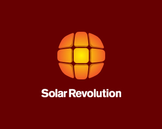
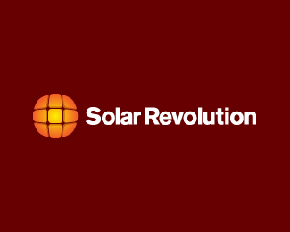
Logo concept for a company specializing in solar integration.
Status:
Work in progress
Viewed:
1825
Share:

Lets Discuss
This look like the ''radio canada'' logo. u should have a look
ReplyThanks for the input kyrross. I checked out the logo you mentioned and there are a few similarities in the shape of the mark and the fact it is made up of different pieces. However there is still enough difference to make them unique.**This logo mark was created by morphing flat solar panels and giving them dimension to illustrate solar change. You can view a larger version of the icon in my showcase.
ReplyPlease login/signup to make a comment, registration is easy