Yallawain
by Type08 • Uploaded: Apr. 12 '10

Float
(Floaters:
13 )
Description:
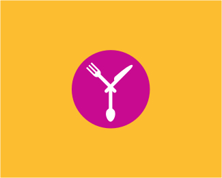
Logo proposal for a restaurant review and search engine based in Kuwait. Letter Y shaped out of knife, fork and spoon. Also includes an arrow as a direction symbol.
Status:
Unused proposal
Viewed:
4292
Share:

Lets Discuss
very nice logo man!
ReplySpasibo bolshoe, Ivan! :)
Replyg8 idea allen...but the knife looks more like a barbers shaving blade thingy...:P
ReplyYou are right Nitish, fixed and updated... *But let me correct you as well buddy, what does G8 means? Gate? :) You have to write GR8 if you want to say GREAT! Anything involving 8 is my turf man %3B)
Replylol...cool gr8...but i still feel the knife's sharp edge needs to be facing the spoon, mite create a better balance...what do u say?
ReplyBelieve it or not, I used a fan logic here, knife is usually used with the fork so I decided to face those two...
ReplyVery nicely done bro!
ReplyThanks a lot Fabster!
ReplyNice mark, Al!
ReplyThank you, Daliano! :)
ReplyLot of fun, Alen!
Reply10:10: am..
Replywell done buddy really memorable
ReplySean and Stylesh, thank you mates!
ReplyPlease login/signup to make a comment, registration is easy