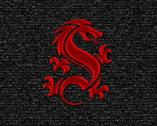
SC Monogram Dragon
by Logomotive • Uploaded: Apr. 11 '10 - Gallerized: Apr. '10

Float
(Floaters:
99 )
Description:
An old idea I once created using a Gothic Blackletter S. Thought it resembled a dragon, so I added legs and claws.
Status:
Just for fun
Viewed:
23,339
Share:


Lets Discuss
I like the mark, look's nice!
ReplyThanks Christian.
ReplyStylish with meaning! China spirits!
Replynice dragon there.
Replylove the dragon, very cool!
ReplyNice Mike, love the mark.
ReplyNice Mike, good stuff always.
Replyawesome!
ReplyThanks guys, anyone want to buy it? Need money to pay Taxes :(
ReplyLooks great mate!!
ReplyAwesome dragon man.
ReplyDefinitely on the fav list.
Replyif it was any hotter it would be on fire... oh wait - it is!
Replyvery cool, Mike. great style on this baby. terrific, Mike
ReplyGood stuff, really nice, Mike.
ReplyLove the dragon Mike. Another great one from you.
ReplyEPIC, great job LM.
ReplyLooks great Mike. Maybe white text would work better with the red mark. Either way, sweet job sir.
ReplyVery Strong work!
ReplyThanks guys, here's the Letterform (S) I used for the body of the dragon. http://www.letterheadfonts.com/fonts/hindlewood.php
ReplyTerrific job, Mike!
Replyyou love those letterhead fonts, dont'cha, mike? %3B) totally awesome by the way.
ReplyIn awe as usual.
Replysolid!
ReplyThanks guys. Yes Paul, they're golden :)
ReplyEmbroidered on black silk will make a killer martial arts uniform.*Awesome!**
ReplyThanks Nolete, yeah be cool. Would also look nice Foil stamped in red on black cards.
ReplyWhat's type is Shanghai, Mike?
Reply%5E That would be Matt Antique, great typeface. http://new.myfonts.com/fonts/bitstream/matt-antique/
ReplyThanks, Mike. A pricey little bugger, isn't it? :)
ReplyThank Alen. Epsilon yeah it is but understandable.
Replywao!!!!!
ReplySweet mark Mikey!
ReplyThanks Ruben and Riz.
Replya little photoshop update.
Replyoverall added effects often ruin a logo, however the shading (blendmode%3Esatin?) on this one really compliments it, well done!
ReplyFloris I agree, effects often ruin things.
ReplyHonestly!! I'm very confused! I really don't know which logo I like the most. you are one of the best.
ReplyWow, Thanks a lot Ghiath! means a lot, Love your elegant calligraphy work.)
ReplyThanks Kral.
ReplyWhy are all my comments jacked up on everything David? Anyone else experiencing this?
Reply^yes
Reply^Same here
ReplyCause I'm a duffus and a programming hack and had coded the site in such a way that allowed XSS attacks and malicious code to get in, i currently fixed that issue (knock on wood) but the previously formatted text now shows up looking like your comments above, I may be able to fix that, however I wanted to make sure that the more important issue of blocking malicious code was taken care of first.
ReplyThanks all!
ok fixed, just wanted to make sure what im doing compatible with XSS attack security.
ReplySomeone wanted to buy this for 250 bucks? Should I??
ReplyOnly you know the answer to that Mike but certainly don't undersell yourself.
Reply^ You know I was being sarcastic :)
ReplyGood, it's worth at least 100 bucks. ;)
ReplyBetter to be a smart ass than a dumb ass :)
ReplyPlease login/signup to make a comment, registration is easy